Zouras Fishers
Logotype, Brand Identity, Web Design
Zouras Fishers is a key player in the fish trade in Greece and has been present in the market since 1965. Their activities include retail, wholesale and exporting of wild fish. We were tasked to redesign their identity and their website which would act as the company’s main online presence.
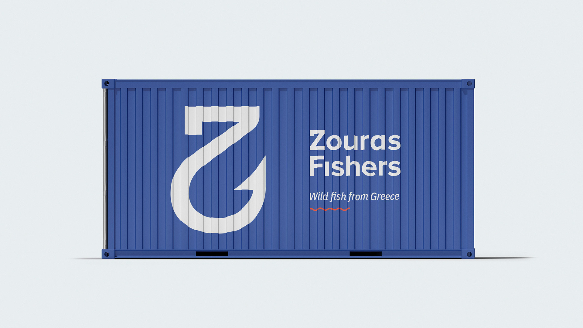
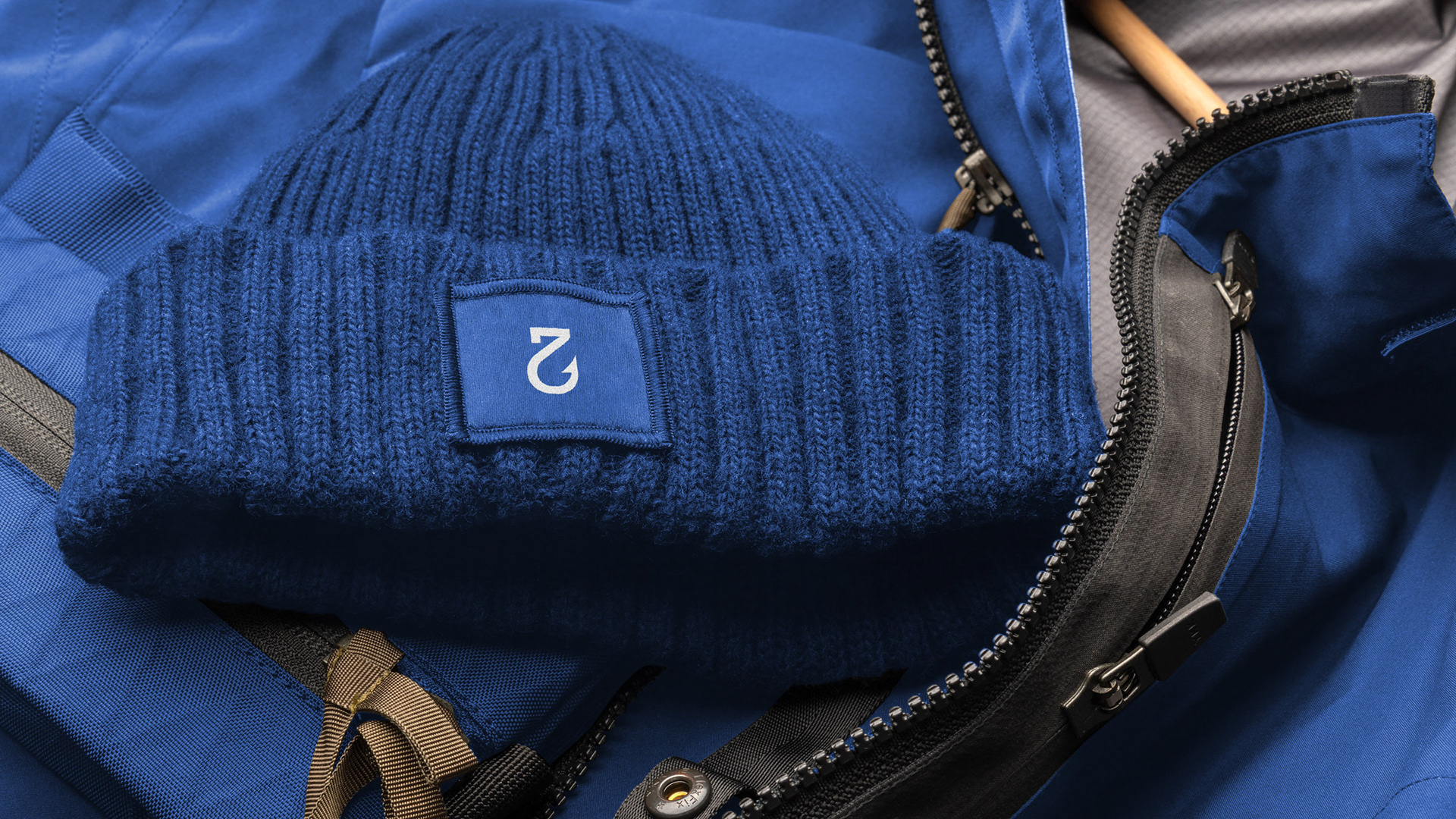
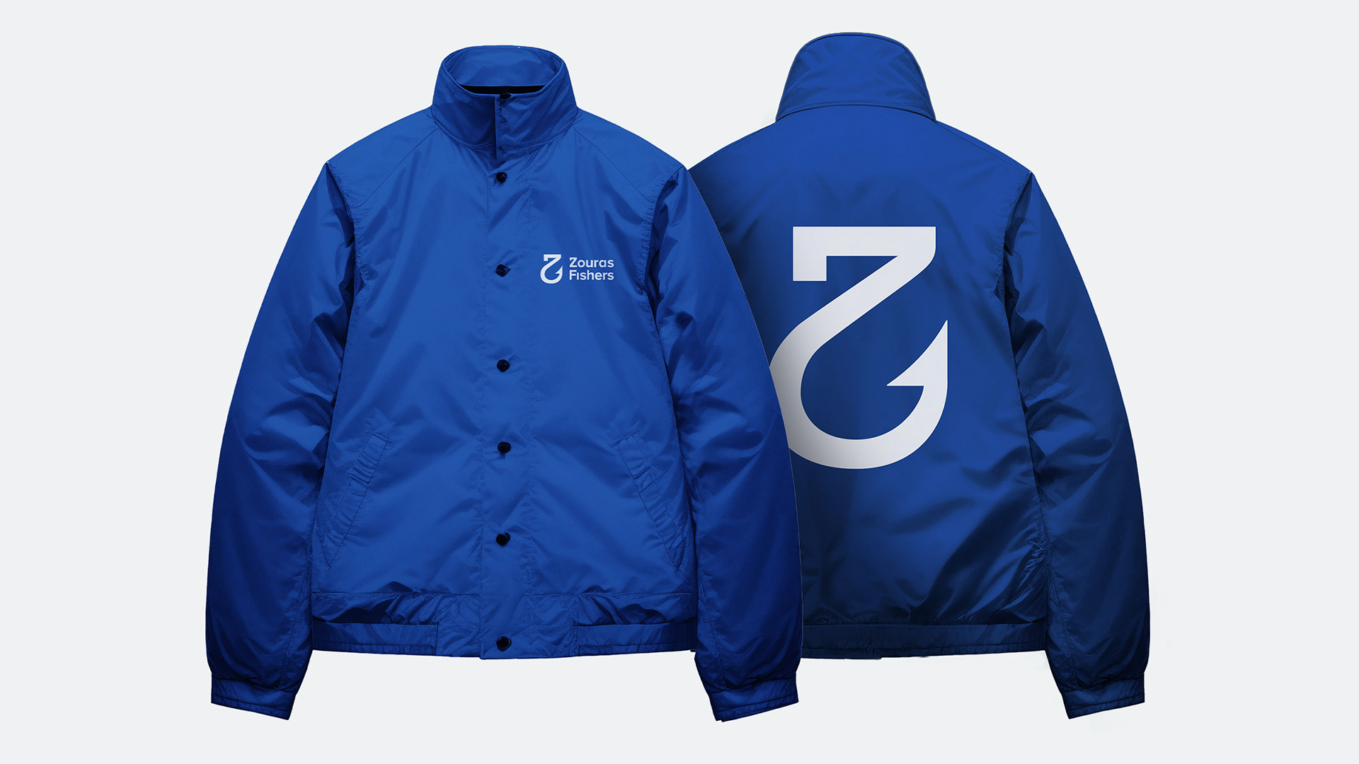
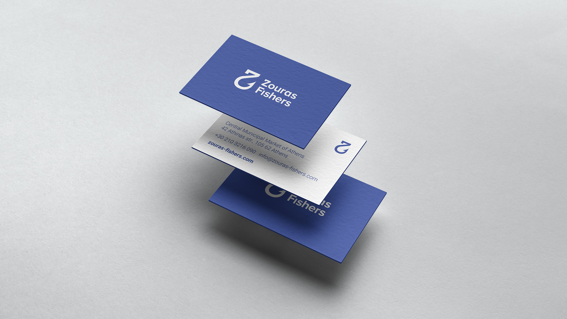
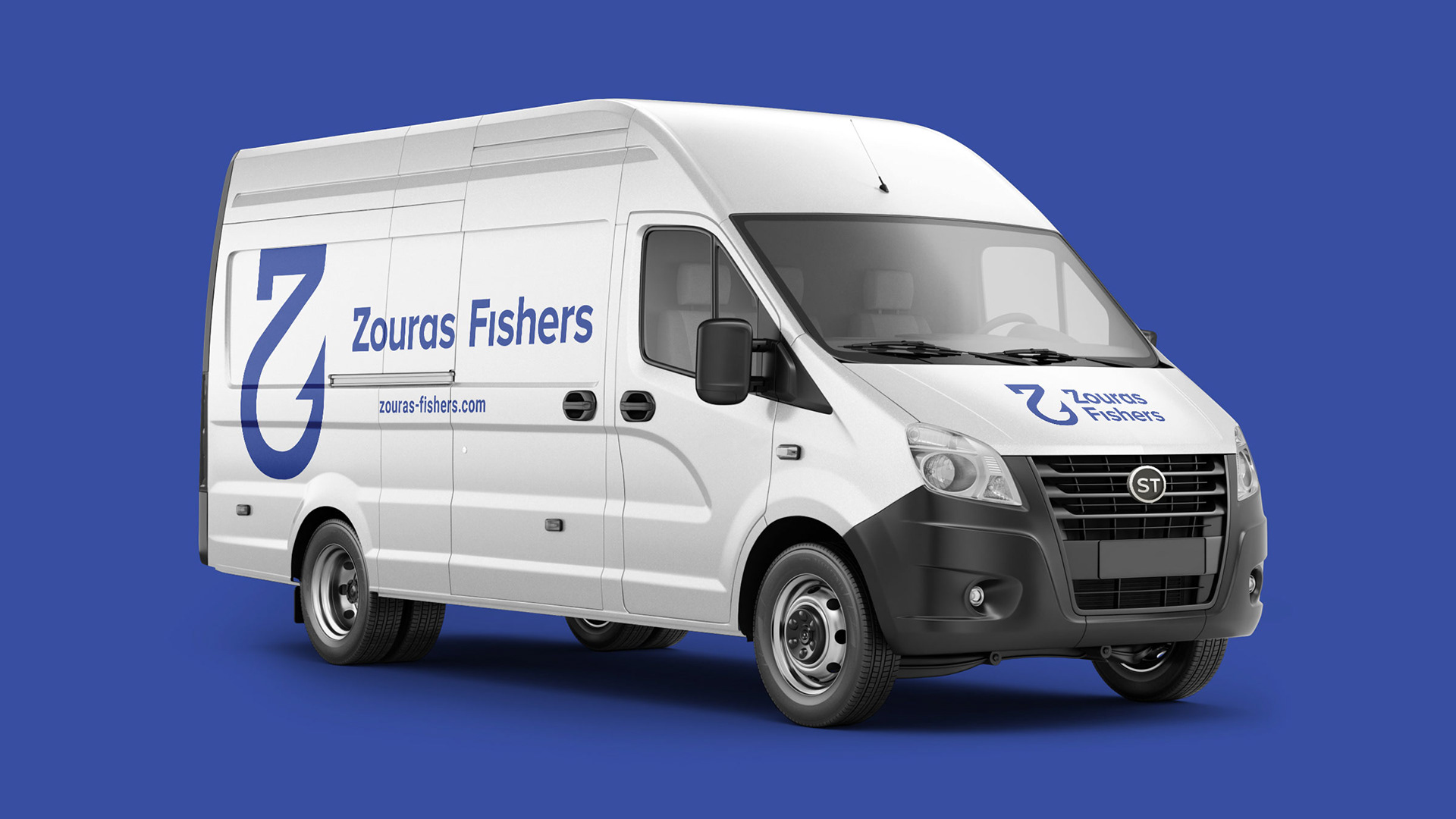
The Zouras Fishers logotype is composed by the “Z” symbol and a minimal typography to enhance readability. The symbol is derived from the initial letter of the company’s name and a fishing hook that symbolizes their trade in wild fish. The straightforward meaning of the symbol is defined by the company’s mindset of straightforwardness and honesty in their dealings.
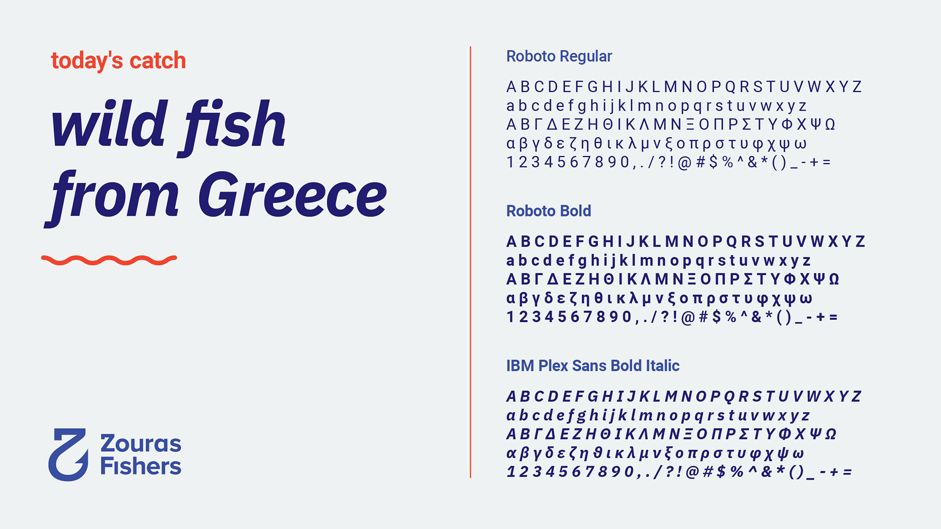
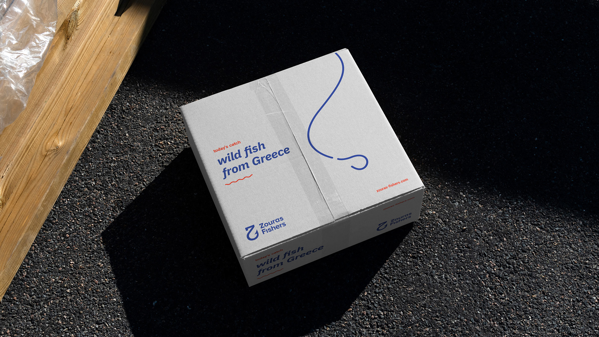
We developed a visual language based on minimalism and simplicity. We utilized a color palette that perfectly describes the category of our client while at the same time being modern and memorable. We used IBM Plex sans as headings and Roboto as body text. This gave the identity a contemporary image, fitting to the company’s ever expanding activities.
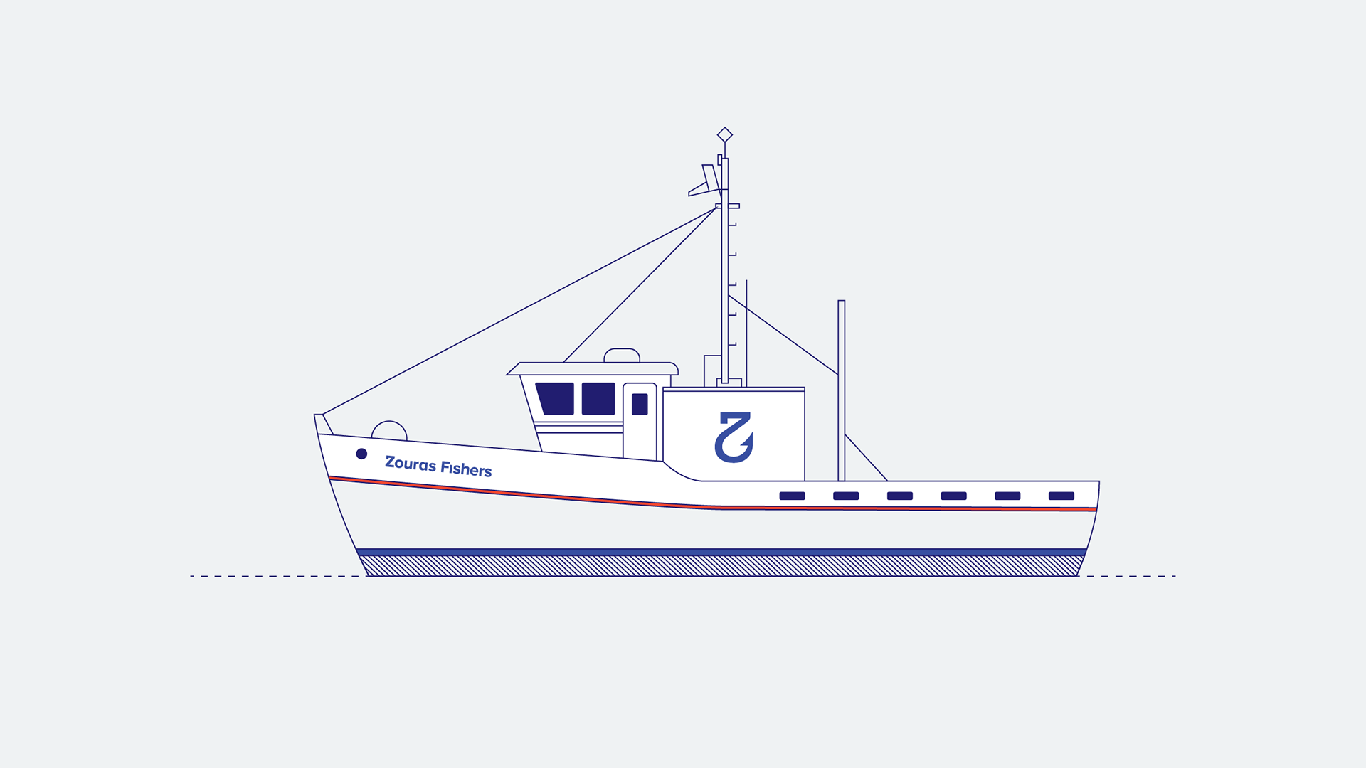
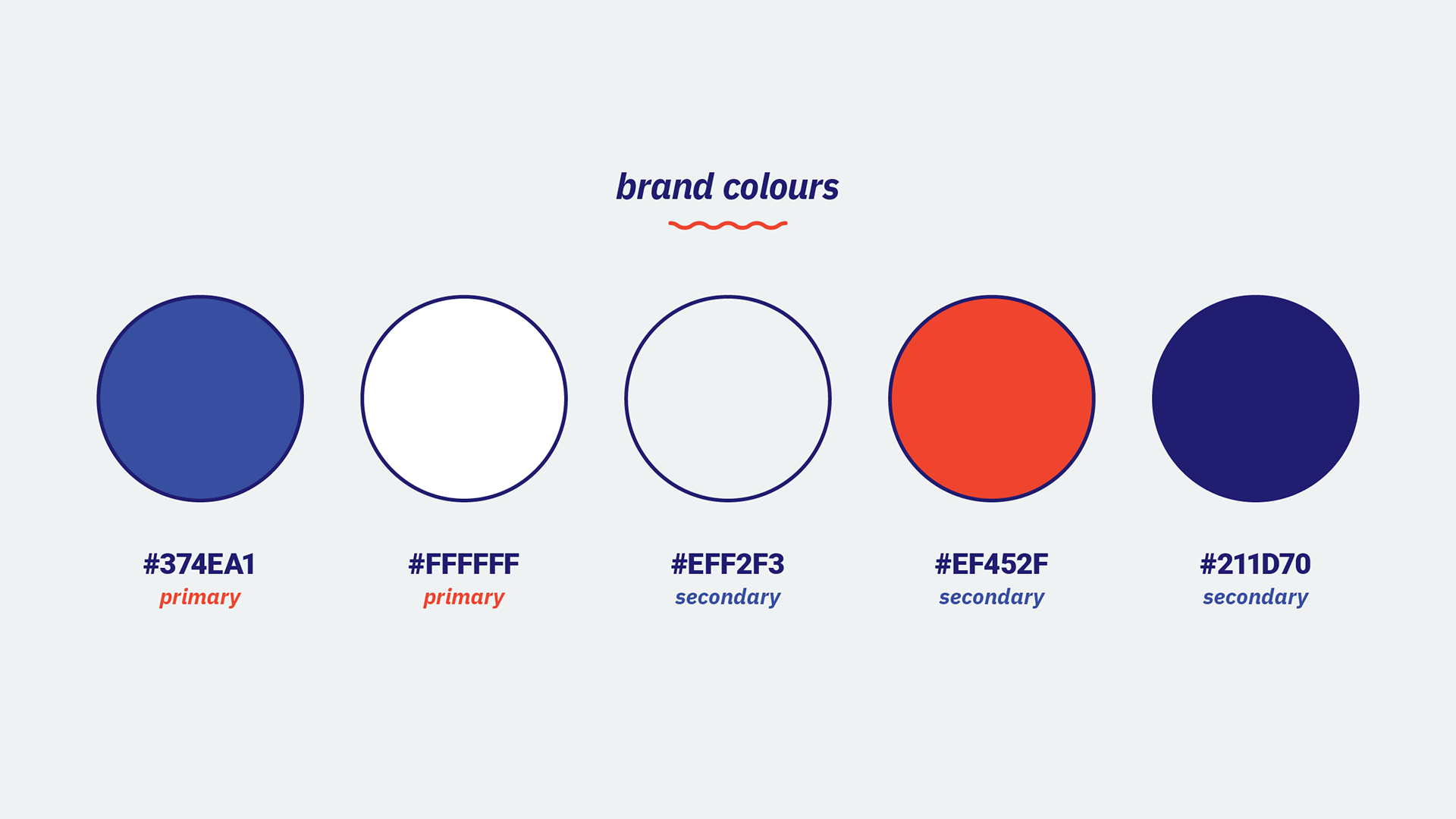
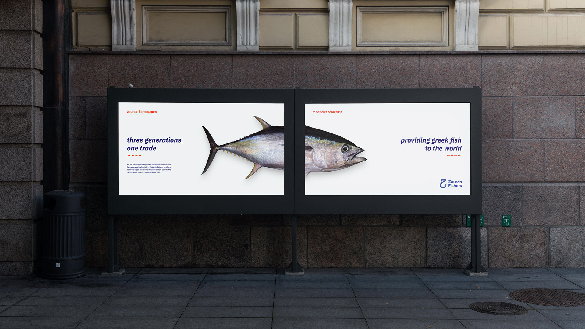
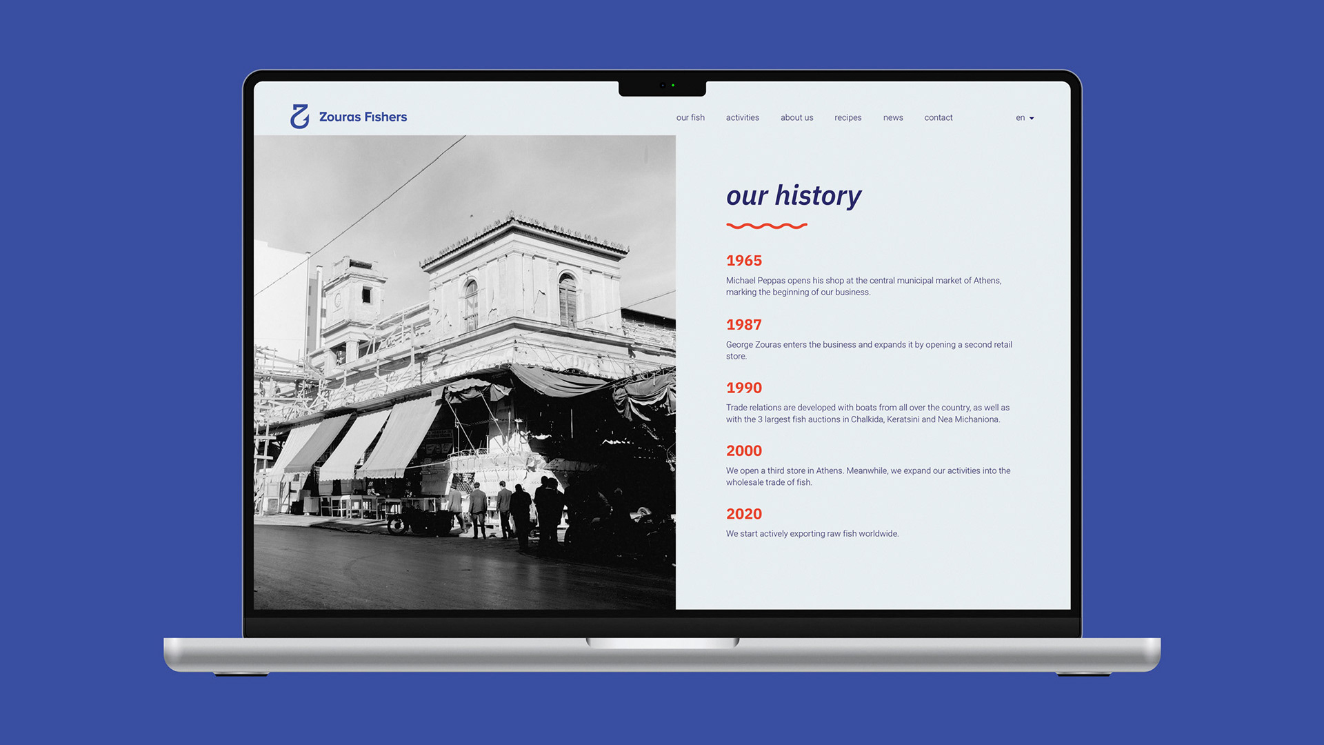
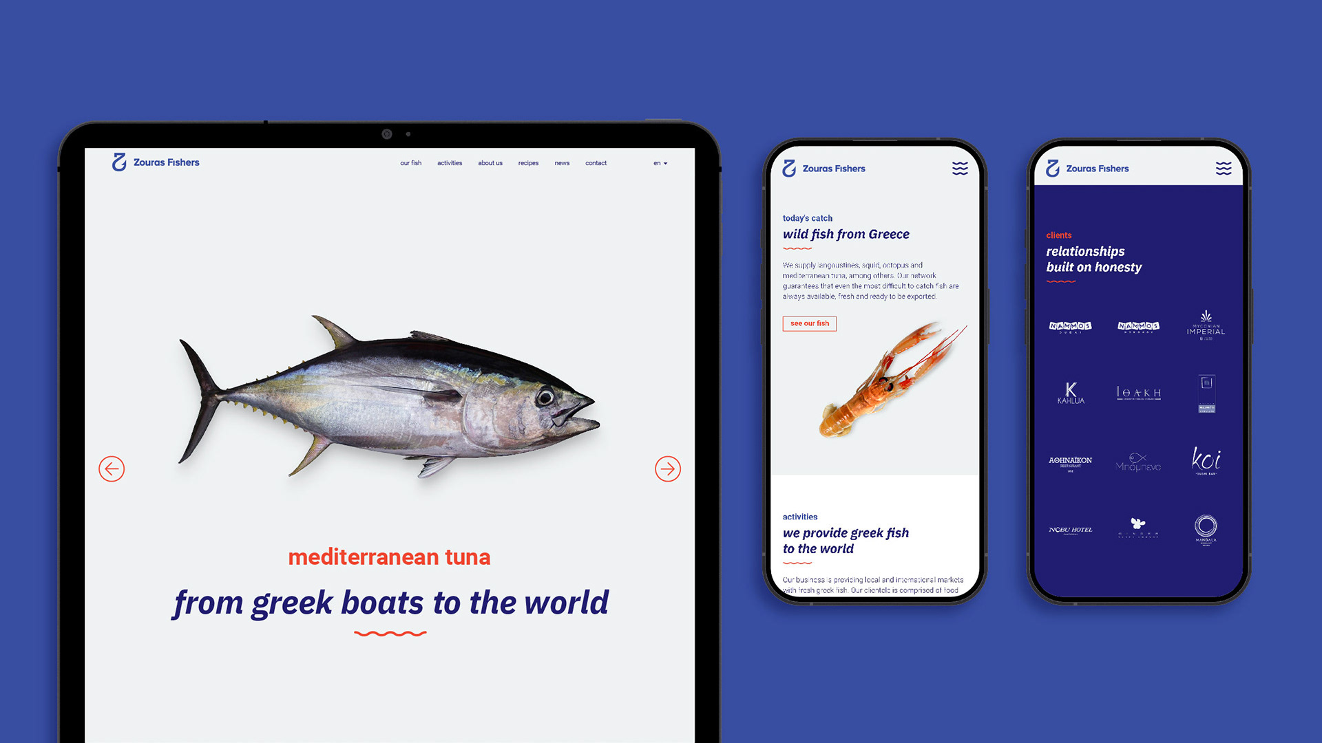
The website inherits the visual elements of the identity. The minimal design serves to bring photographs at the forefront, exhibiting the premium quality fish that Zouras Fishers deal in. The off white background communicates a friendly tone, while synergizing harmoniously with the blue colors. Coral acts as an accent color to highlight information in the website. Contrasting sizes and weights is the key element of the typographic treatment, giving a modern and friendly corporate feel to the site.
