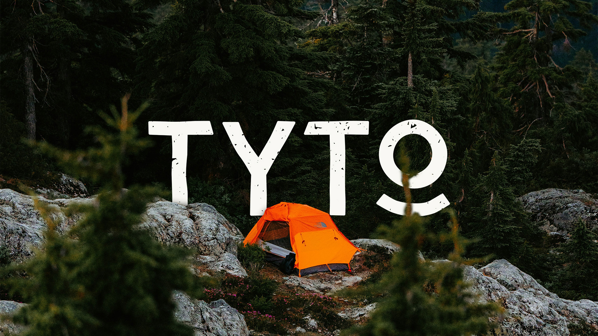
TYTO
Logotype, Brand Identity, Icon System, Signage, UI/UX, Conceptual work
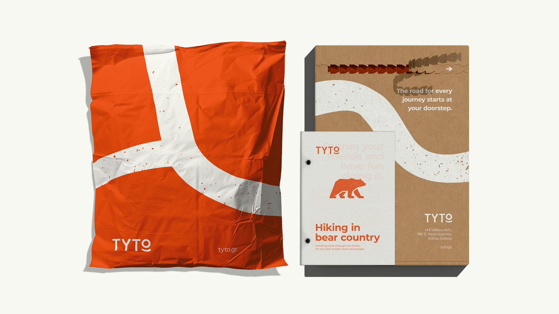
An organization providing information, signage and an application for outdoor enthusiasts.
The scientific name of the barn owl; Tyto alba gives its name to the organization. In Greek tradition the owl symbolizes knowledge, and as a seasoned inhabitant of the forest, it bears the most fitting name for such an organization.
The tagline acts as an easy to remember descriptor of TYTO. "Knowing Nature" is what simply characterizes both the organization and the owl.
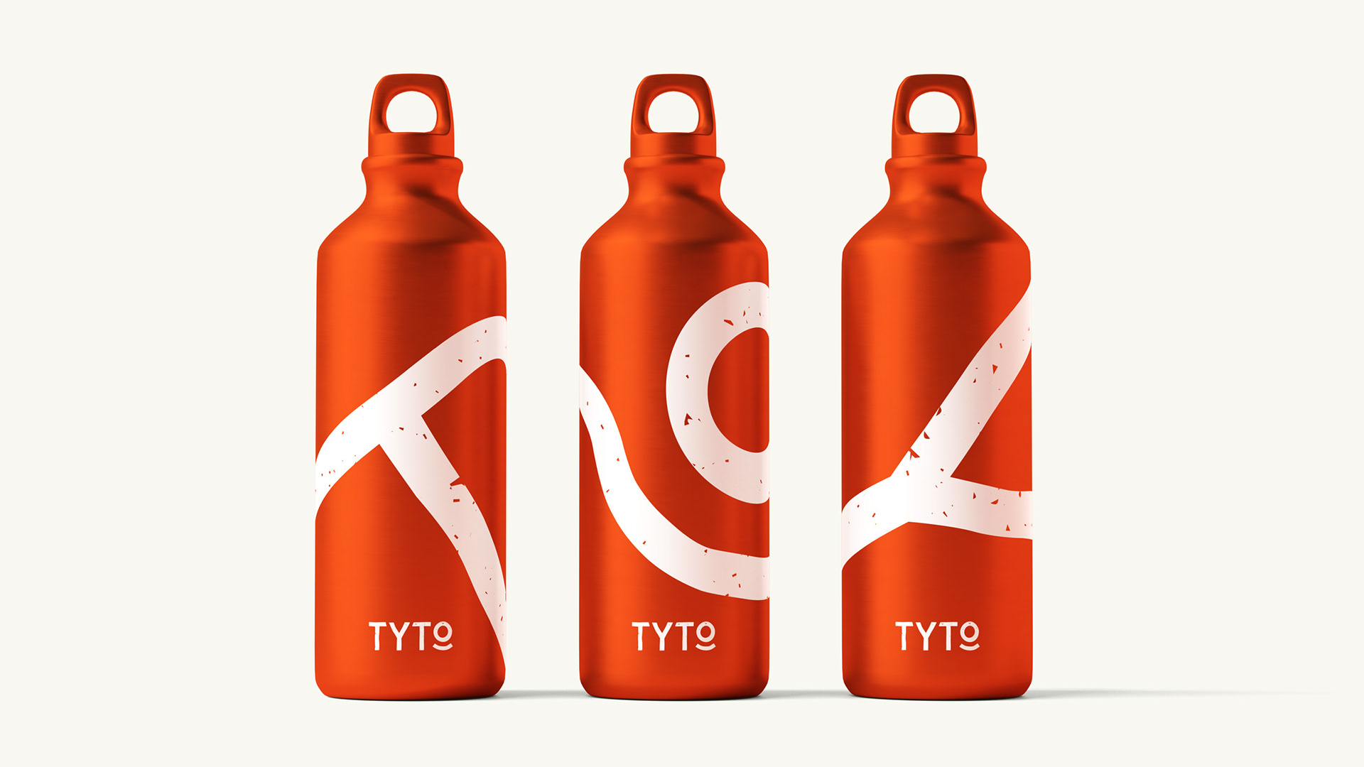
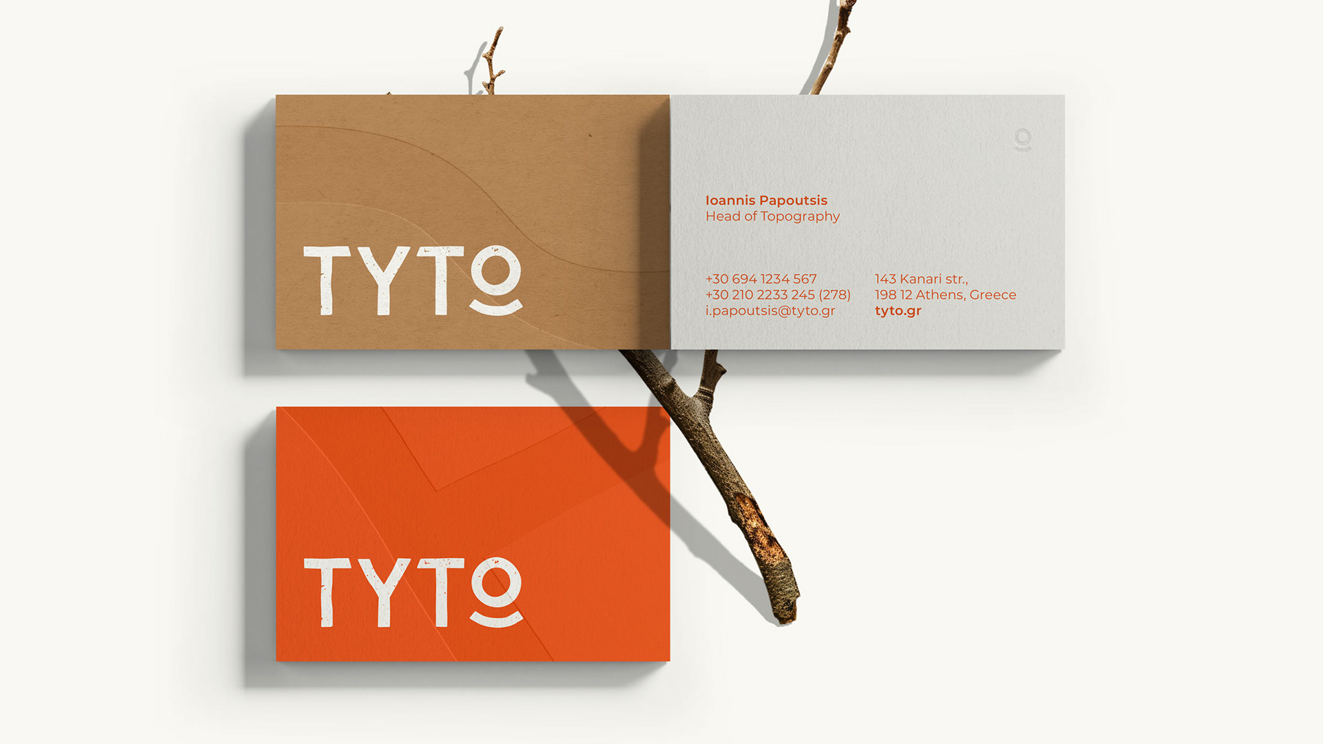
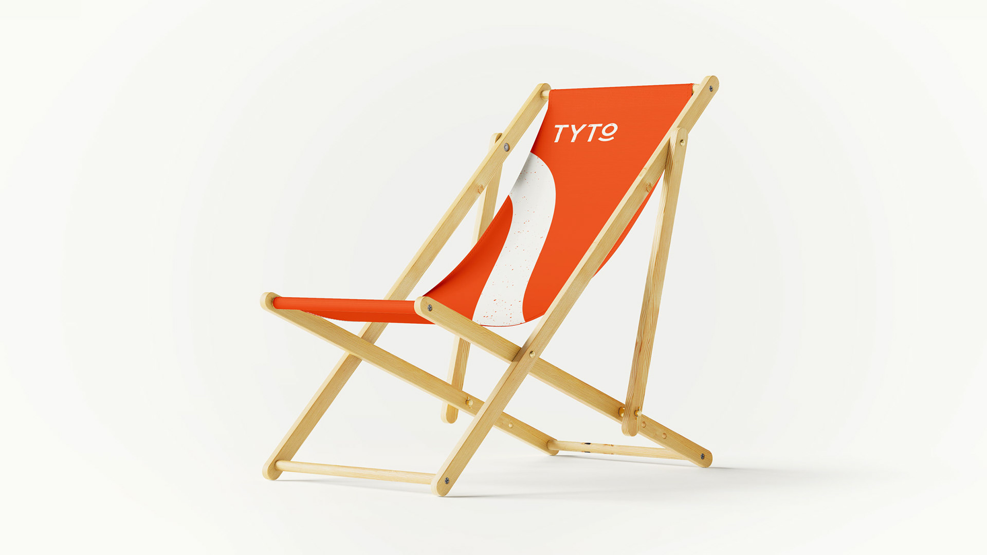
The logotype is shaped by the trails that cross and interweave on the terrain. Geometric shapes are a nod to the analytic nature of TYTO. Orange as a brand color symbolizes activity and liveliness, as these characterize its target audience.
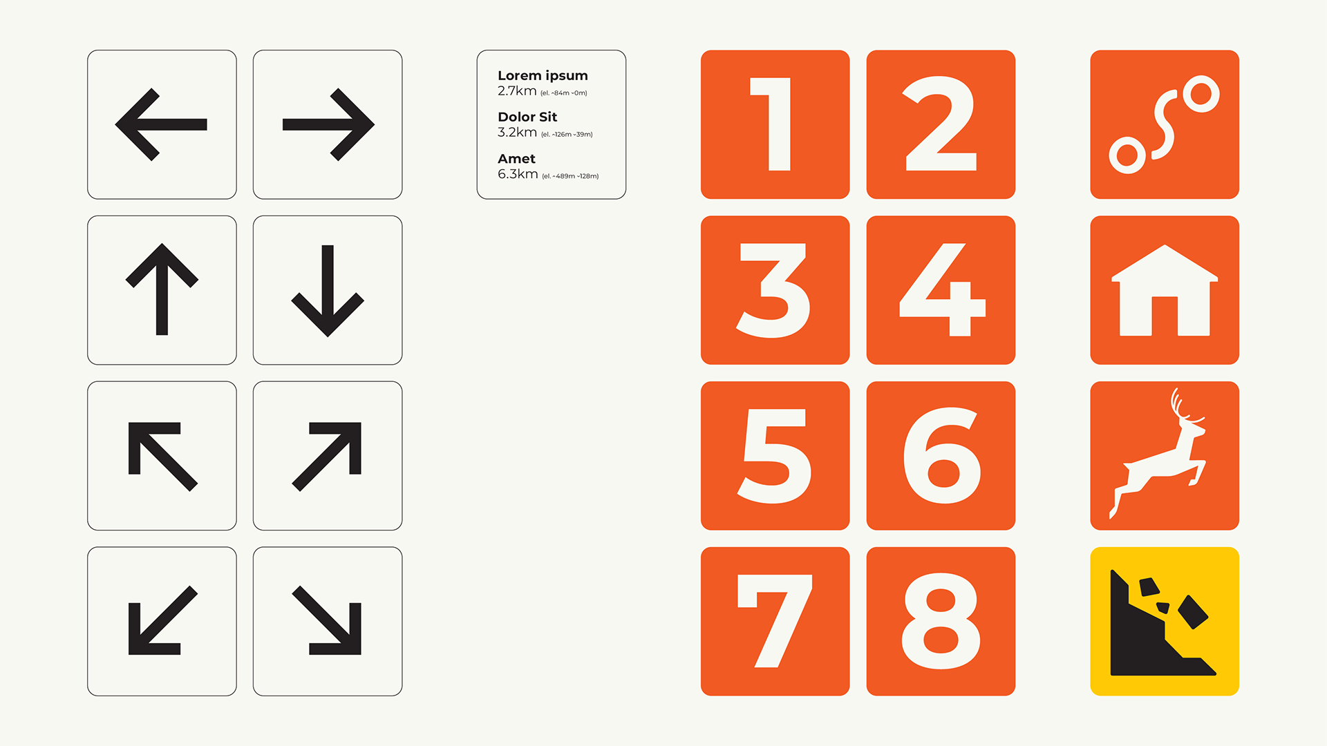
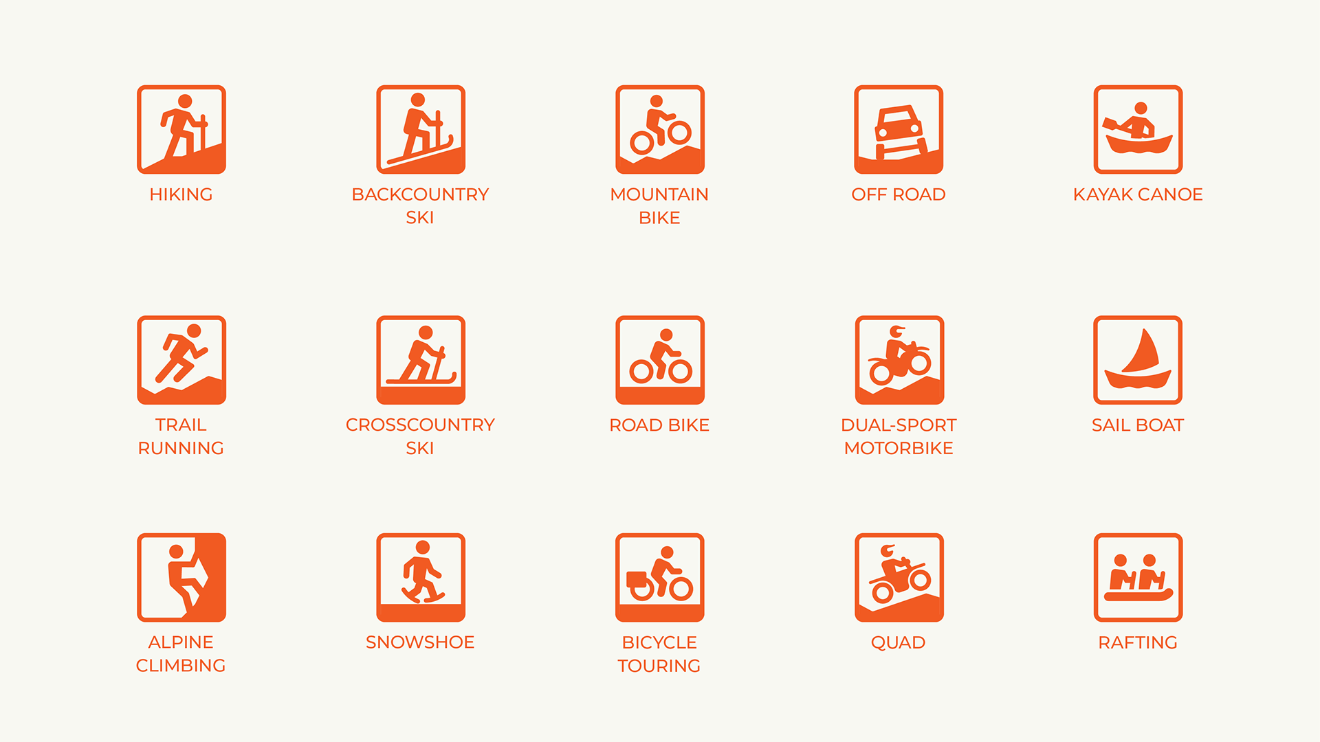
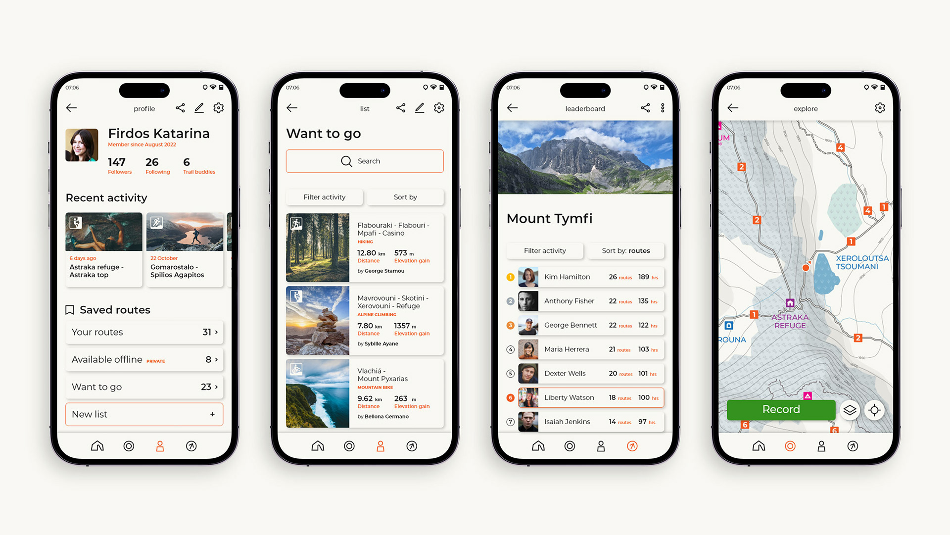
The icon system borrows the design elements of the logotype to create functional communication. Each icon represents an activity included in the application, from hiking to sailing.
The application's UI is designed in a minimalist way to highly promote functionality. The GPS is a useful tool for all hikers and adventurists, while the ability to save and share trails within the app makes it an all inclusive platform. Throughout the user interface dominant brand colors along with typography form the solid identity of TYTO.
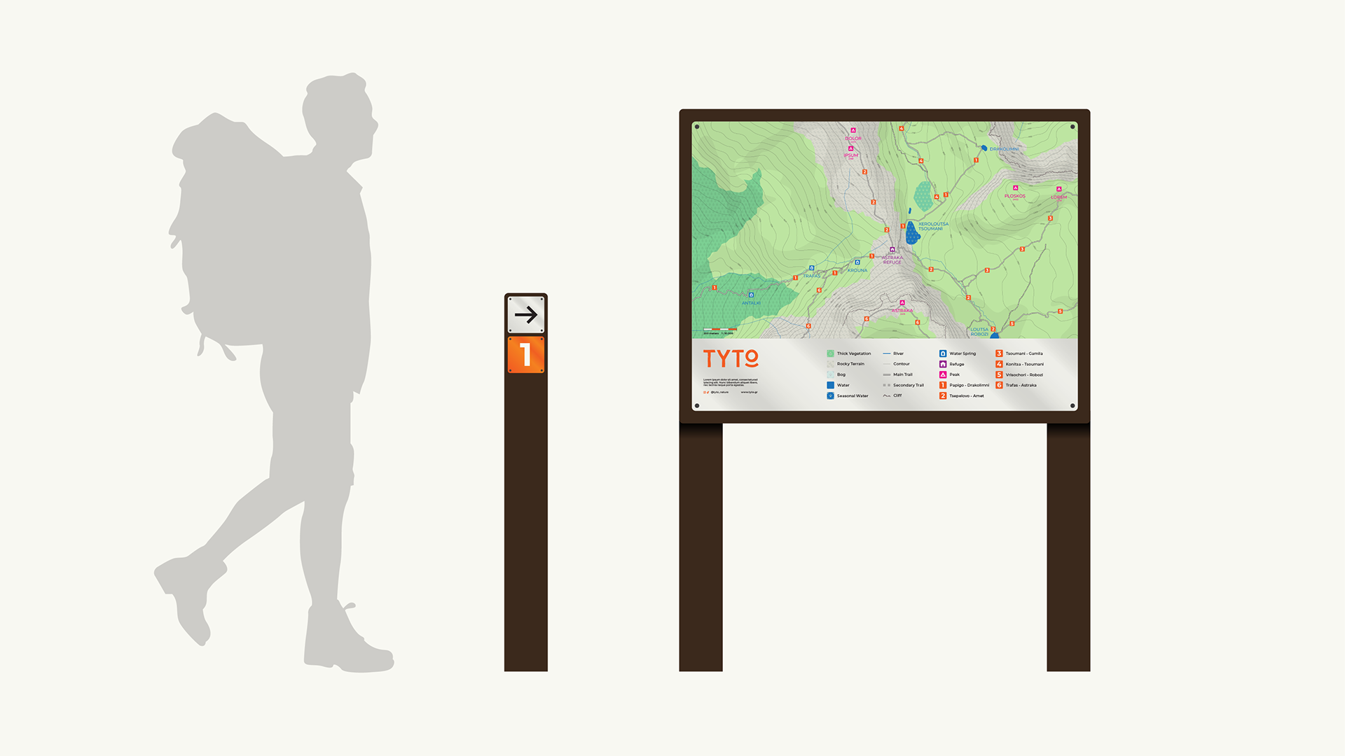
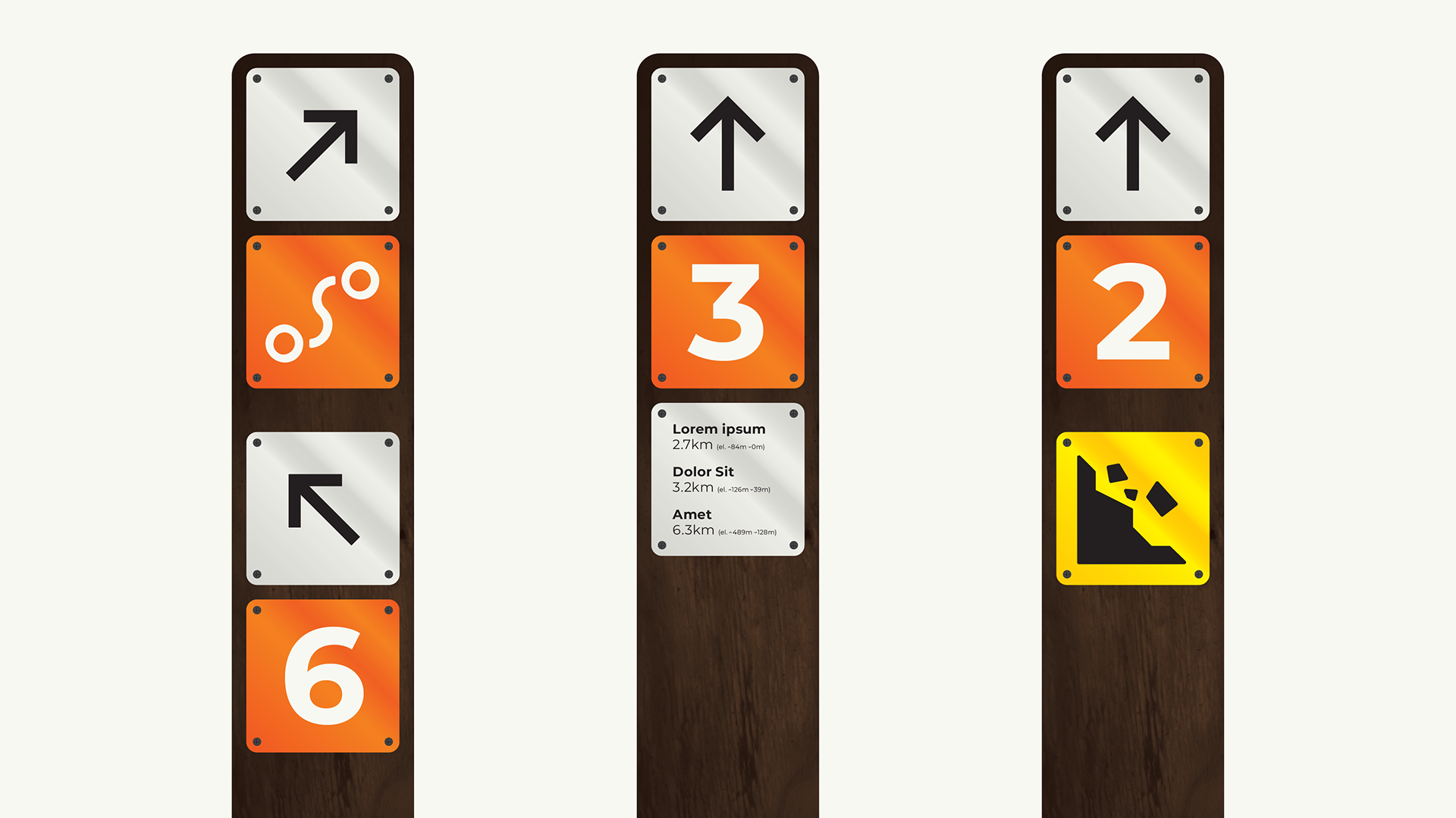
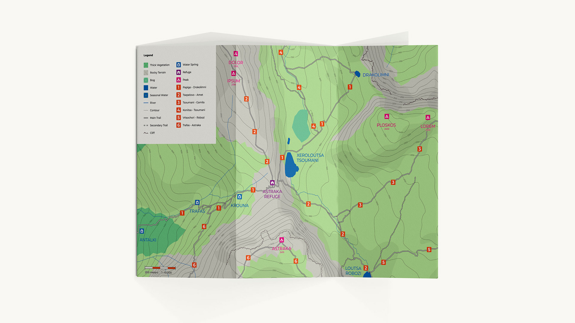
As the signs placed by TYTO are outdoors they need to be universally understood and durable. Different numbers where used to easily identify each trail as to avoid confusion. Direction arrows and milestones including distance and altitude are vital to all trekkers. Connective trails and landmarks are in orange, while danger symbols are in yellow.
The materials of choice are wood poles and reflective metal signs. These ensure that the signage system will be both durable and highly visible.