Prosfora olive oil white bottle floating in the air with its brown cork opening. The bottle features the prosfora logotype that resembles an olive at its center, while typography is in the bottom part of the bottle.
prosfora
Logotype Design, Brand Identity, Packaging Design, Conceptual work​​​​​​​
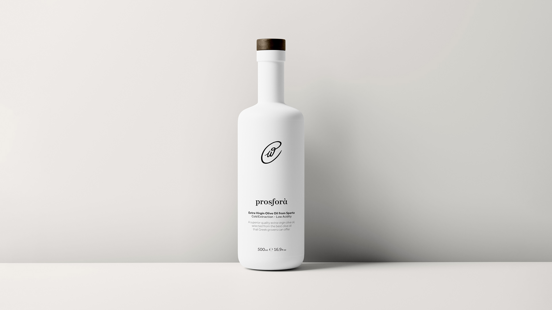
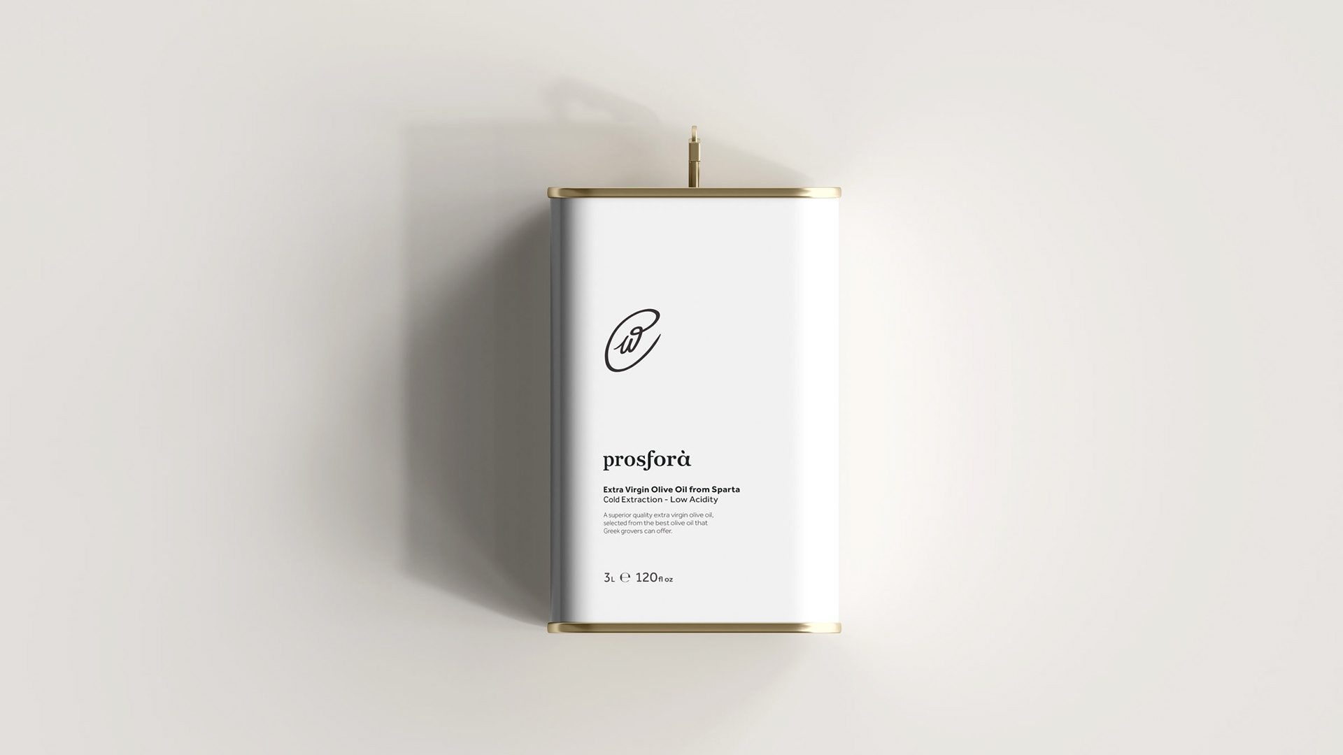
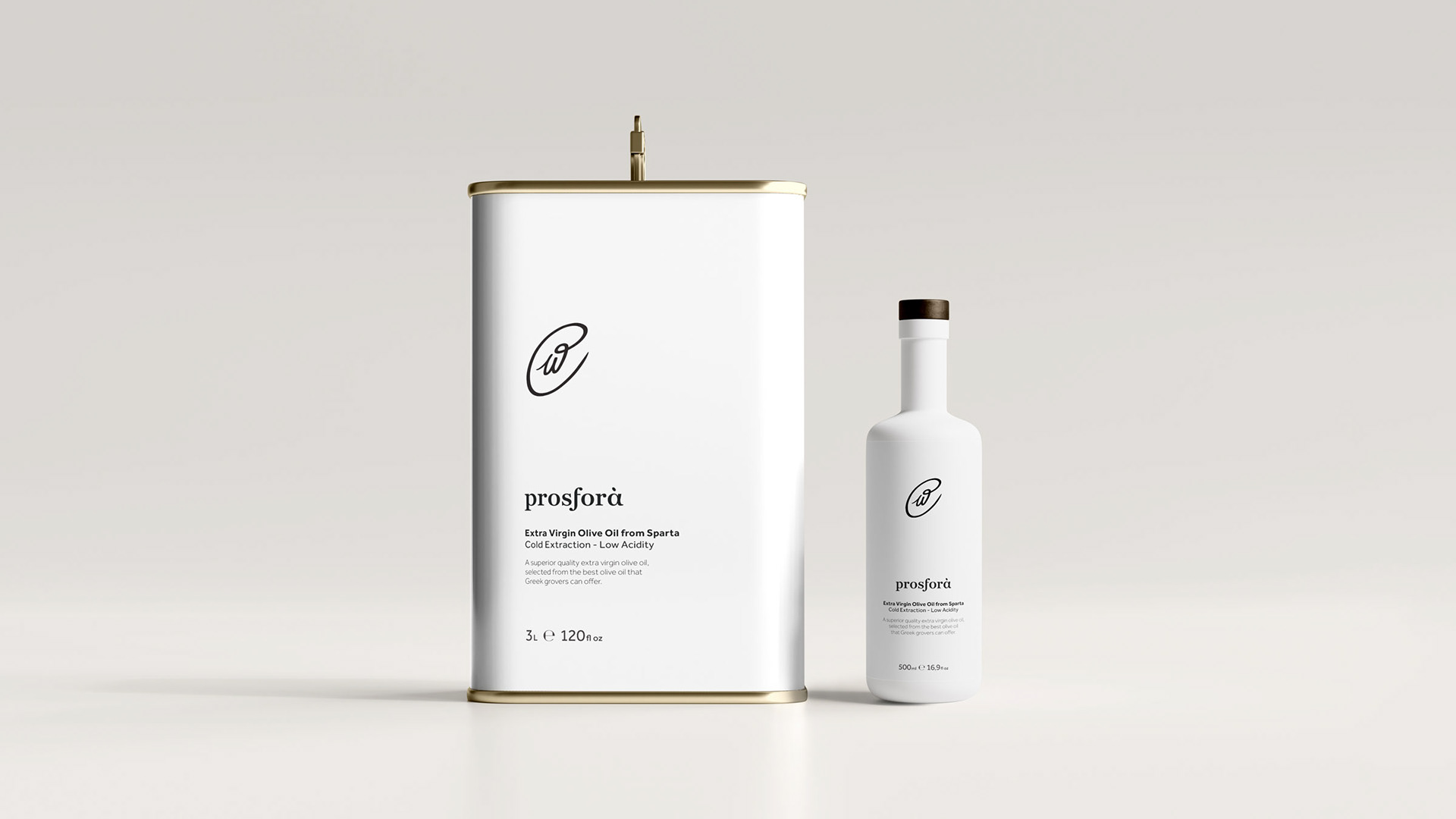
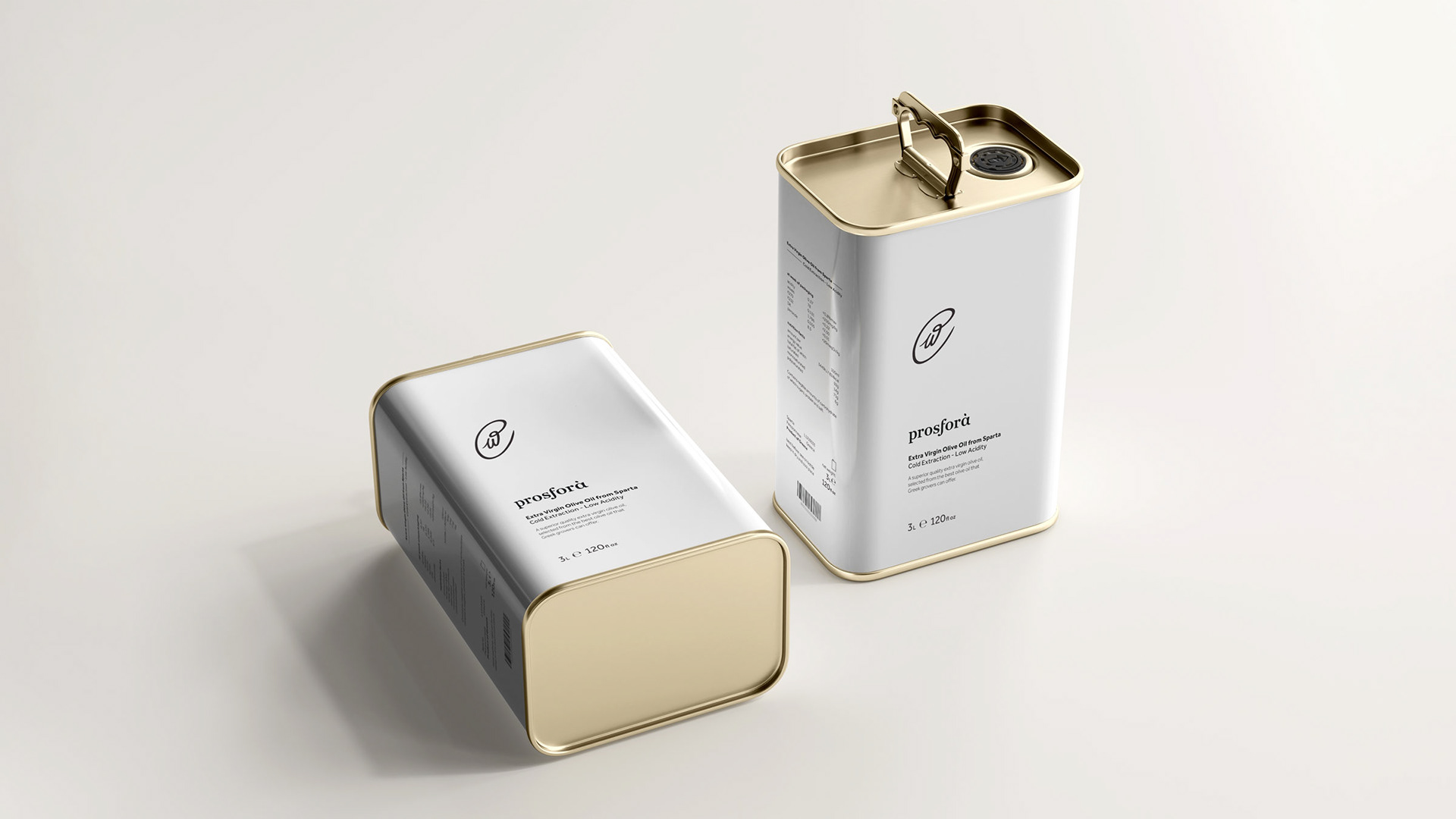
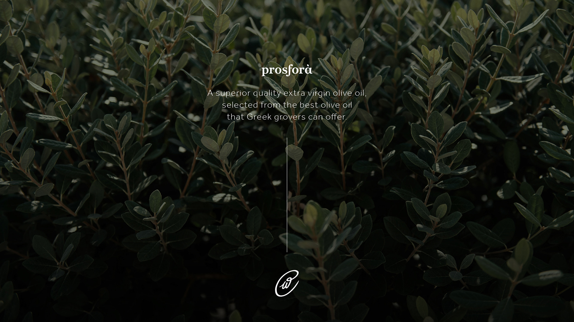
Prosfora (greek προσφορά /pɾo.sfoˈɾa/) the act of offering, giving someone something solemnly as a sign of respect, love, religious worship, etc. That was the core idea of the brand, offering a superior quality extra virgin olive oil to the consumers.
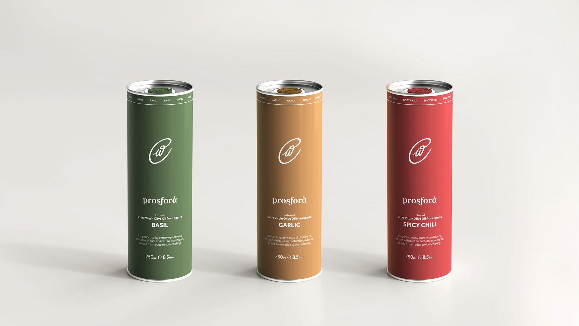
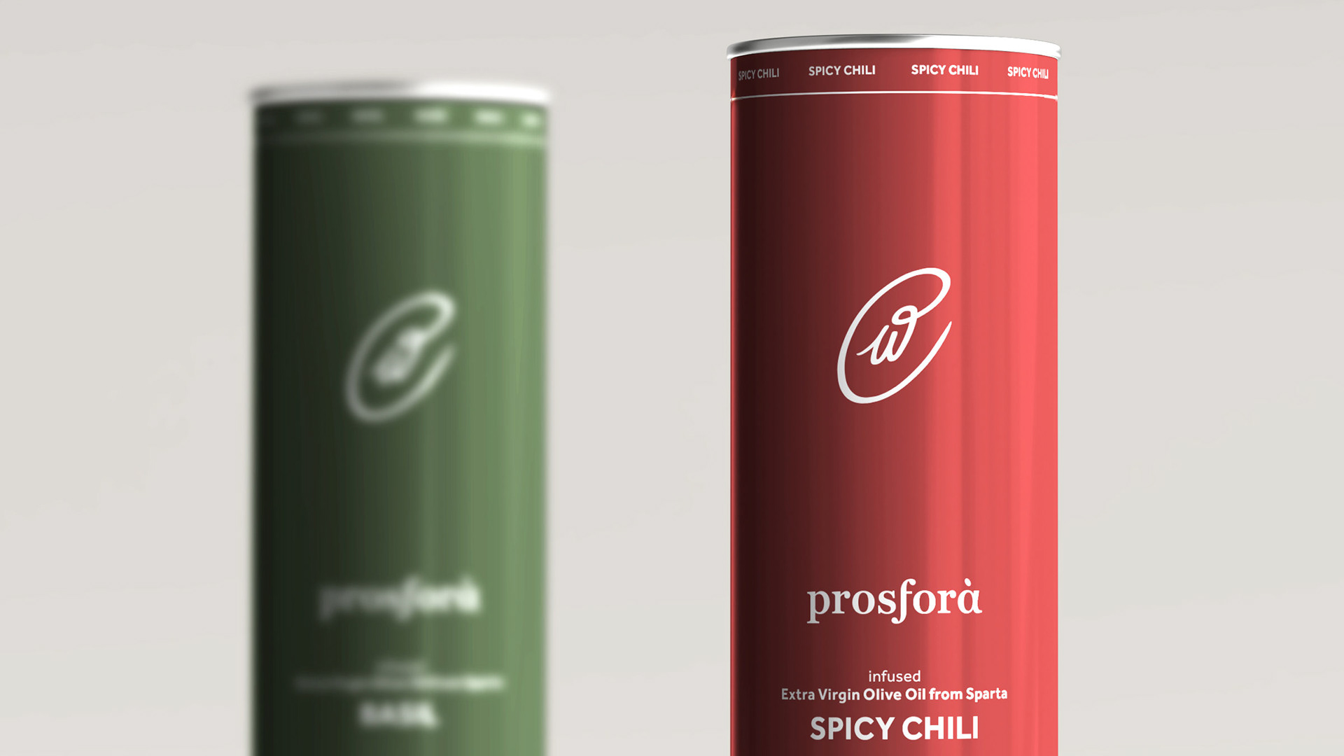
Austere black and white color palette in combination with the clean use of typography, brings forward the absolute purity of the product, while achieving a modern and elegant design. The signature of the brand derives from the greek letter "π" written in calligraphy, placed in the core of a olive shape to resemble the core value of the brand's prosfora-offer of premium quality products.
Prosfora olive oil white bottle standing against a wall. The bottle features the prosfora logotype that resembles an olive at its center, while typography is in the bottom part of the bottle.
The Prosfora olive oil symbol that resembles an olive, placed over an olive grove.
Three Prosfora olive oil white bottles sitting on top of each other sideways and against a wall. The top and bottom ones showcase the front label that features the prosfora logotype that resembles an olive at its center, while typography is in the bottom part of the bottle. The middle one showcases the back label which includes the nutritional values, information and barcode.
Closeup of an olive's branches in the background and in the front a short text about Prosfora olive oil. The text writes "A superior quality extra virgin olive oil, selected from the best olive oil that Greek groves can offer.". The image also includes the Prosfora olive oil logotype that resembles an olive.
Three Prosfora olive oil 250ml tin cans of the flavored varieties, placed next to each other to showcase the packaging design. They all feature the prosfora logotype that resembles an olive at the center, while typography is at the bottom part of the tin. The tins are categorized by color. Green for basil flavored olive oil, amber for garlic flavored olive oil and red for spicy chili flavored olive oil.
Back to Top