Popster
Naming, Logotype, Brand Identity, Web Design
Three friends and a passion for everything pop culture has to offer. That simple concept was all it needed for popster to form as a company. Figurines, board games and every accessory imaginable are up to offer.
We were tasked to come up with the company’s name, design its brand identity and e-commerce website. The complete identity needed to reflect a character with an easy going attitude and high expertise in pop culture. That way it could convey that its subject is their clients’ leisure time, handled in a professional manner.
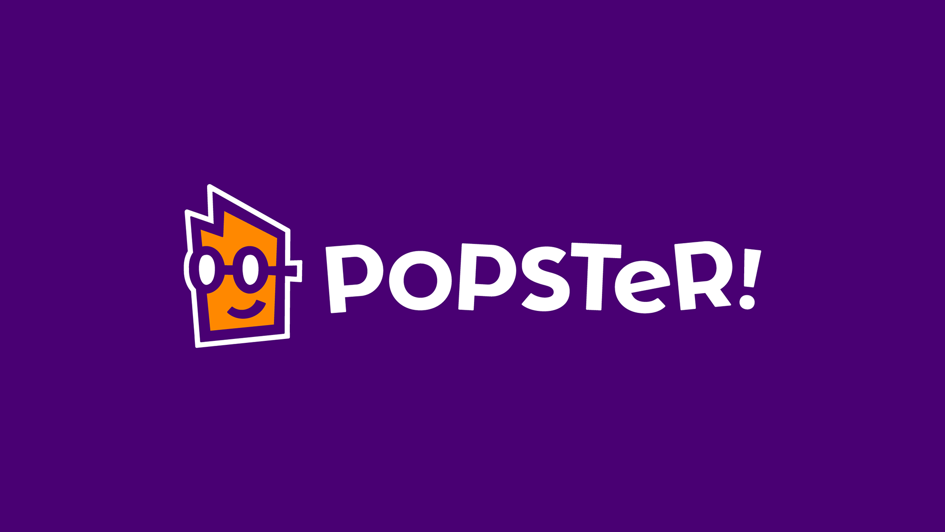
With the key focus of the brand identity being to convey its character, we decided to name the company popster. A name which could be given to a person or company alike, with the only requirement for both being the enthusiasm for pop culture.
We were tasked to come up with the company’s name, design its brand identity and e-commerce website. The complete identity needed to reflect a character with an easy going attitude and high expertise in pop culture. That way it could convey that its subject is their clients’ leisure time, handled in a professional manner.
With the key focus of the brand identity being to convey its character, we decided to name the company popster. A name which could be given to a person or company alike, with the only requirement for both being the enthusiasm for pop culture.
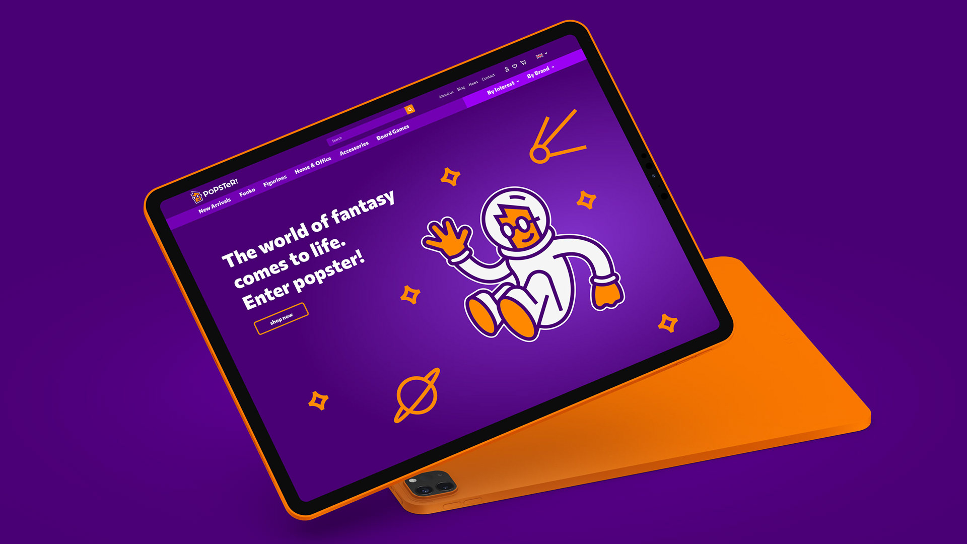
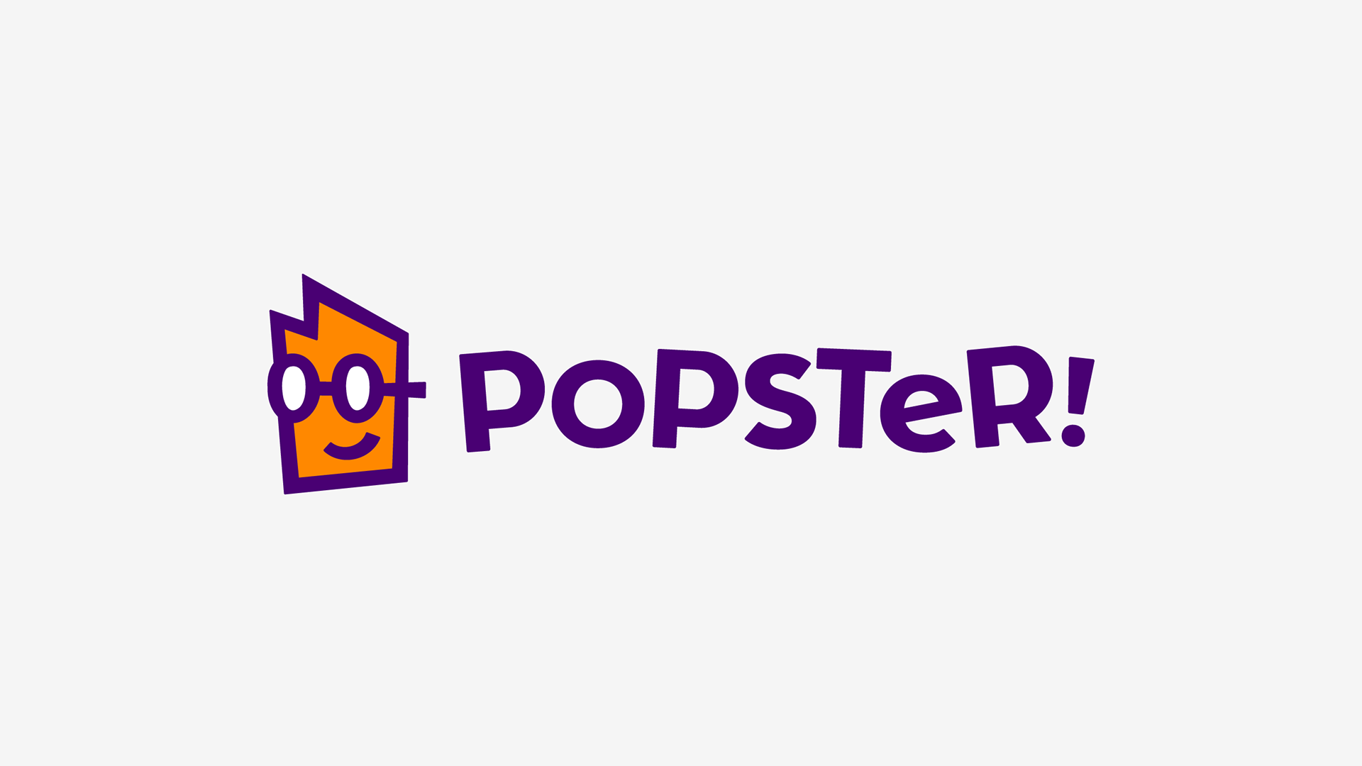
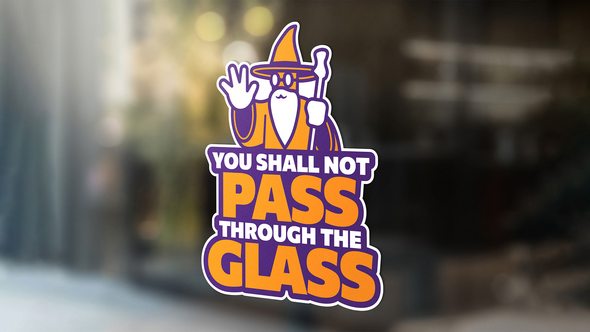
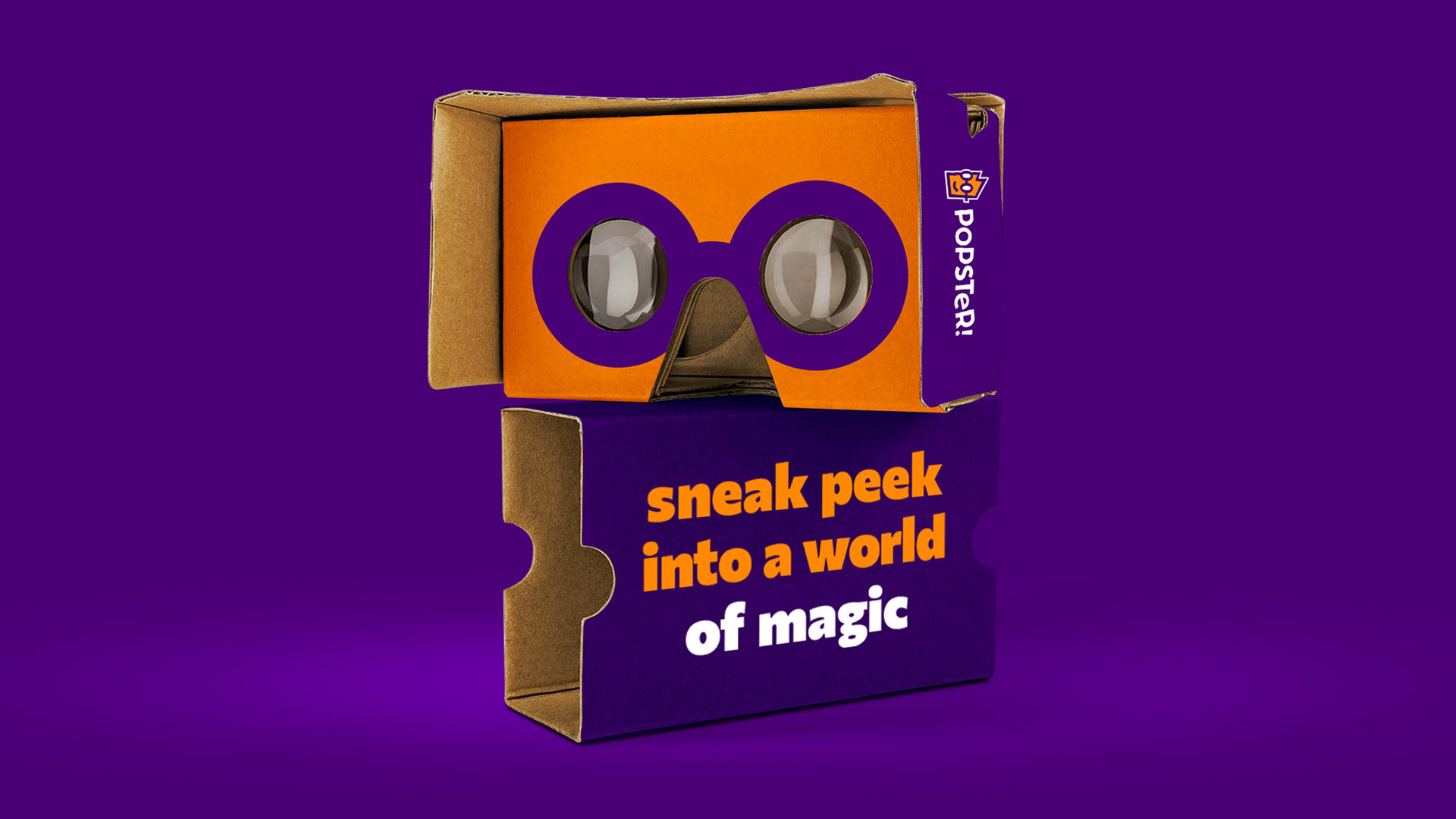
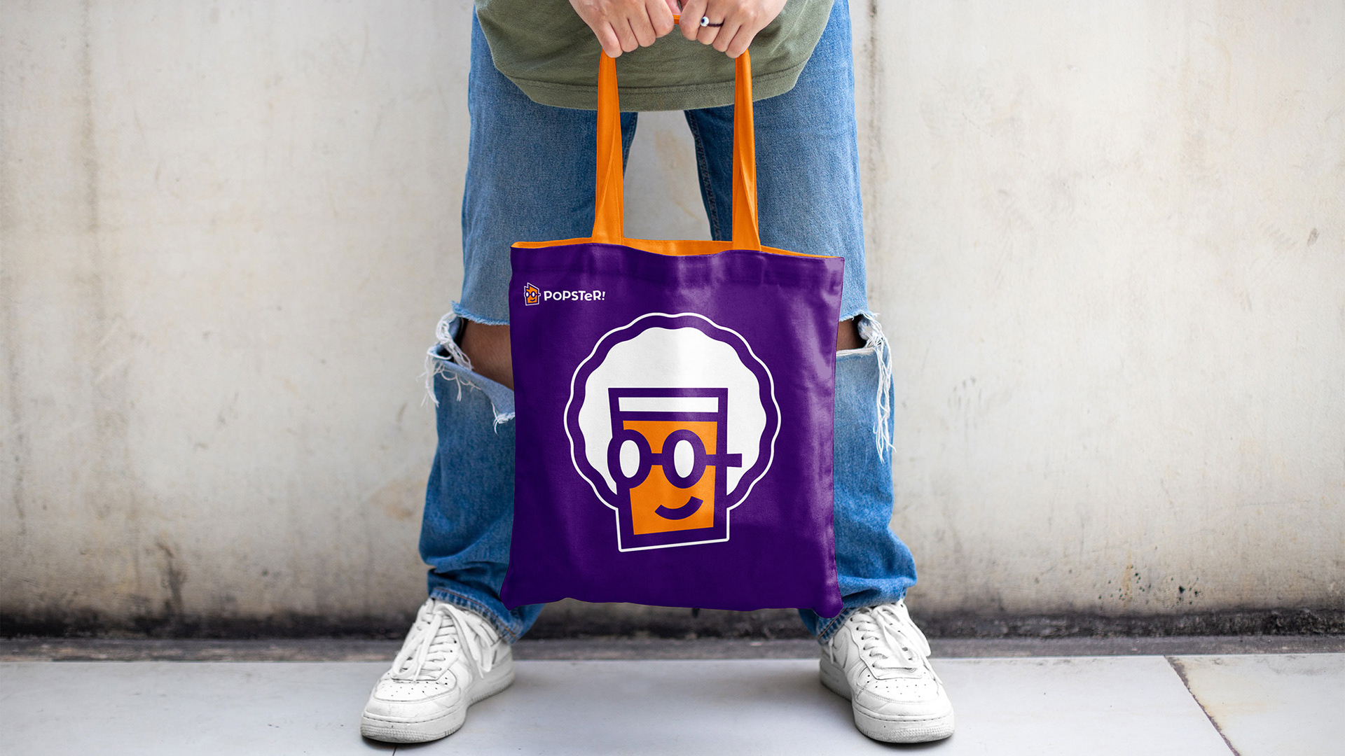
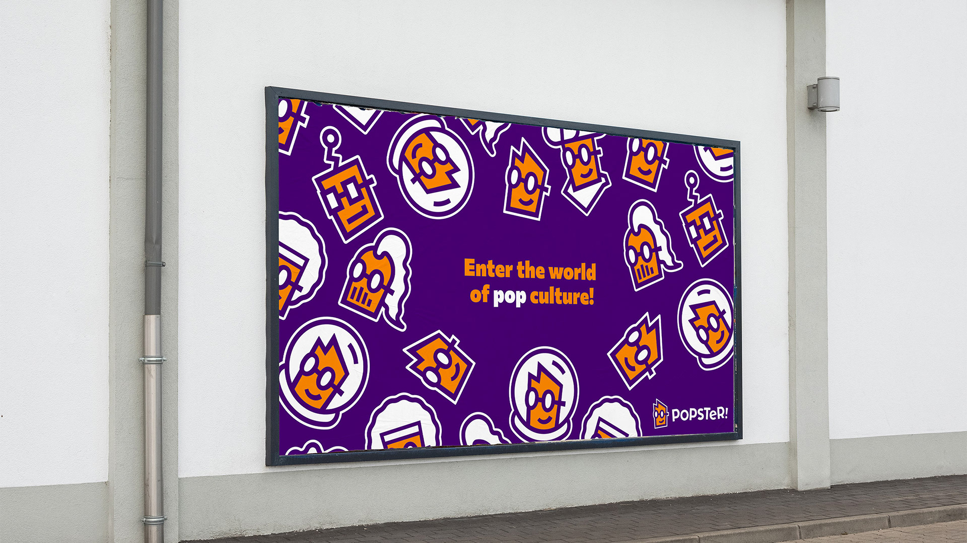
The brand’s identity was developed around the name, so we wrote the name down and noticed something. The “pop” section of the name looked like two eyes. Out of it we formed the pictorial / mascot mark of popster; popster himself.
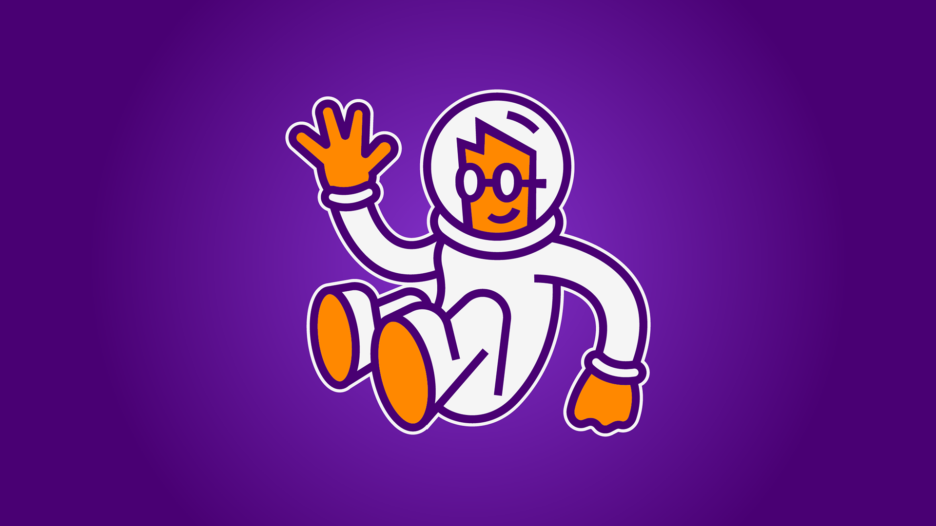
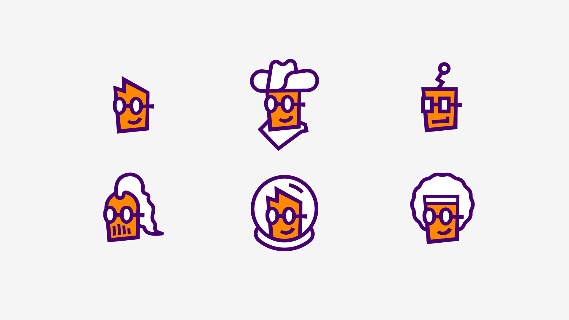
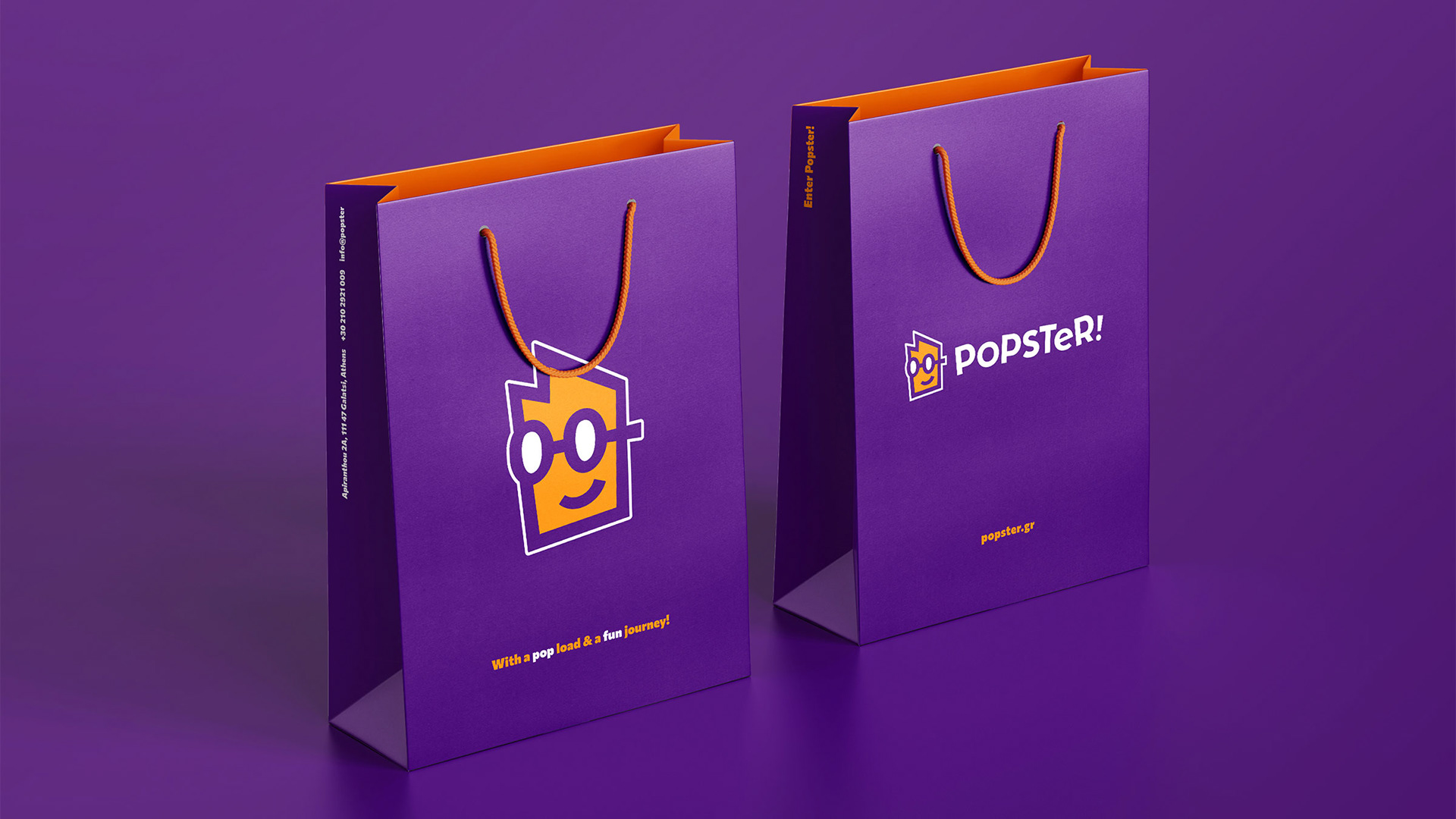
The mascot, as an illustration, can be formed into any character imaginable from cowboy to astronaut. It maintains its recognizability throughout anything it depicts, while being flexible enough to communicate anything. This is achieved through the consistent usage of the glasses, shape and brand colors.
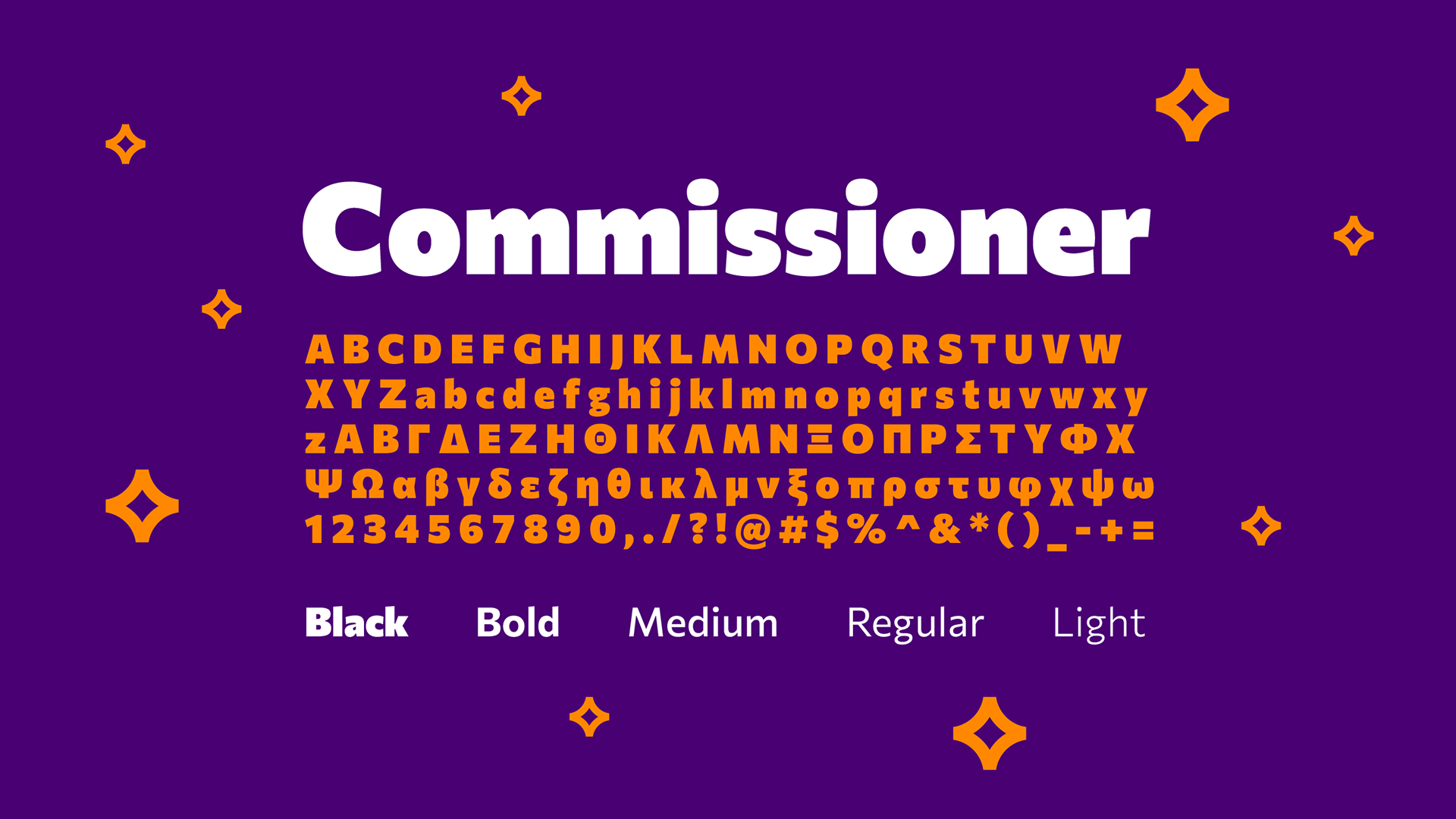
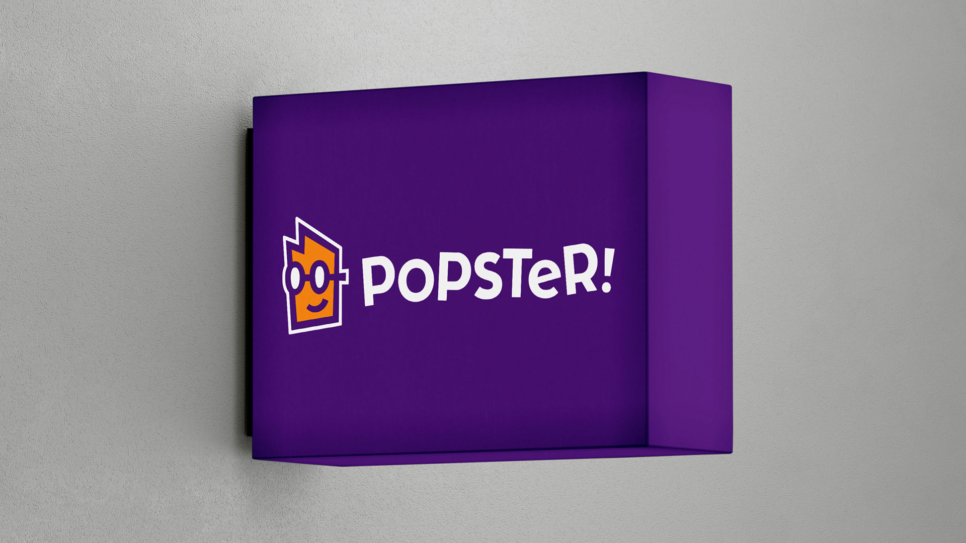
Orange and purple form a color palette that has a playful character. The choice of Commissioner as the identity’s typeface is strategic. The font weighs from black to thin and it covers all aspects of the brand's character. Heavier weights are playful and easy going, while thinner are professional and clean. Allowing us to layer the identity’s character at will, by being playful in some applications and strict in others, as required.
Orange and purple form a color palette that has a playful character. The choice of Commissioner as the identity’s typeface is strategic. The font weighs from black to thin and it covers all aspects of the brand's character. Heavier weights are playful and easy going, while thinner are professional and clean. Allowing us to layer the identity’s character at will, by being playful in some applications and strict in others, as required.
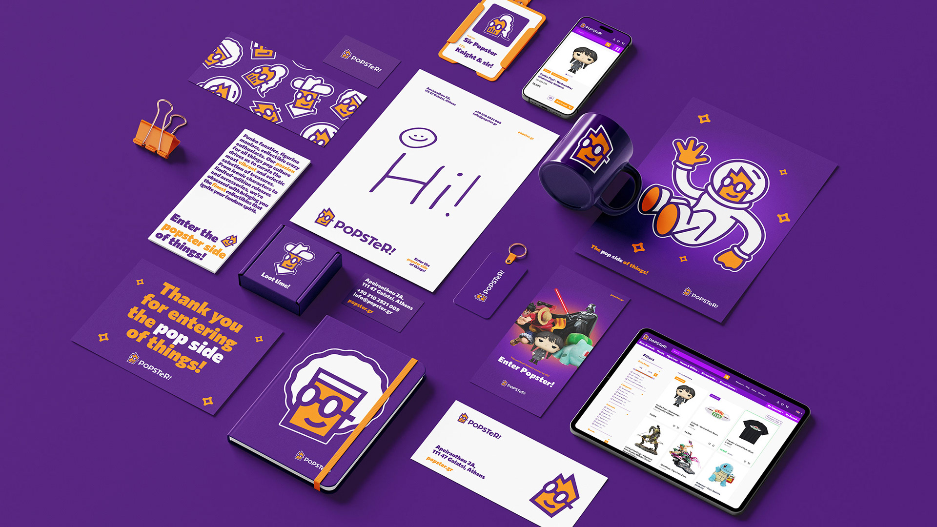
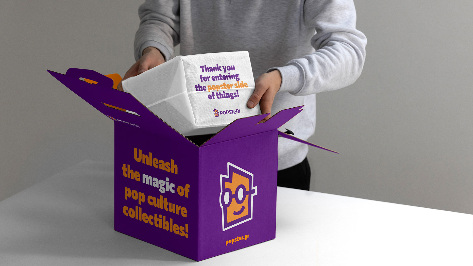
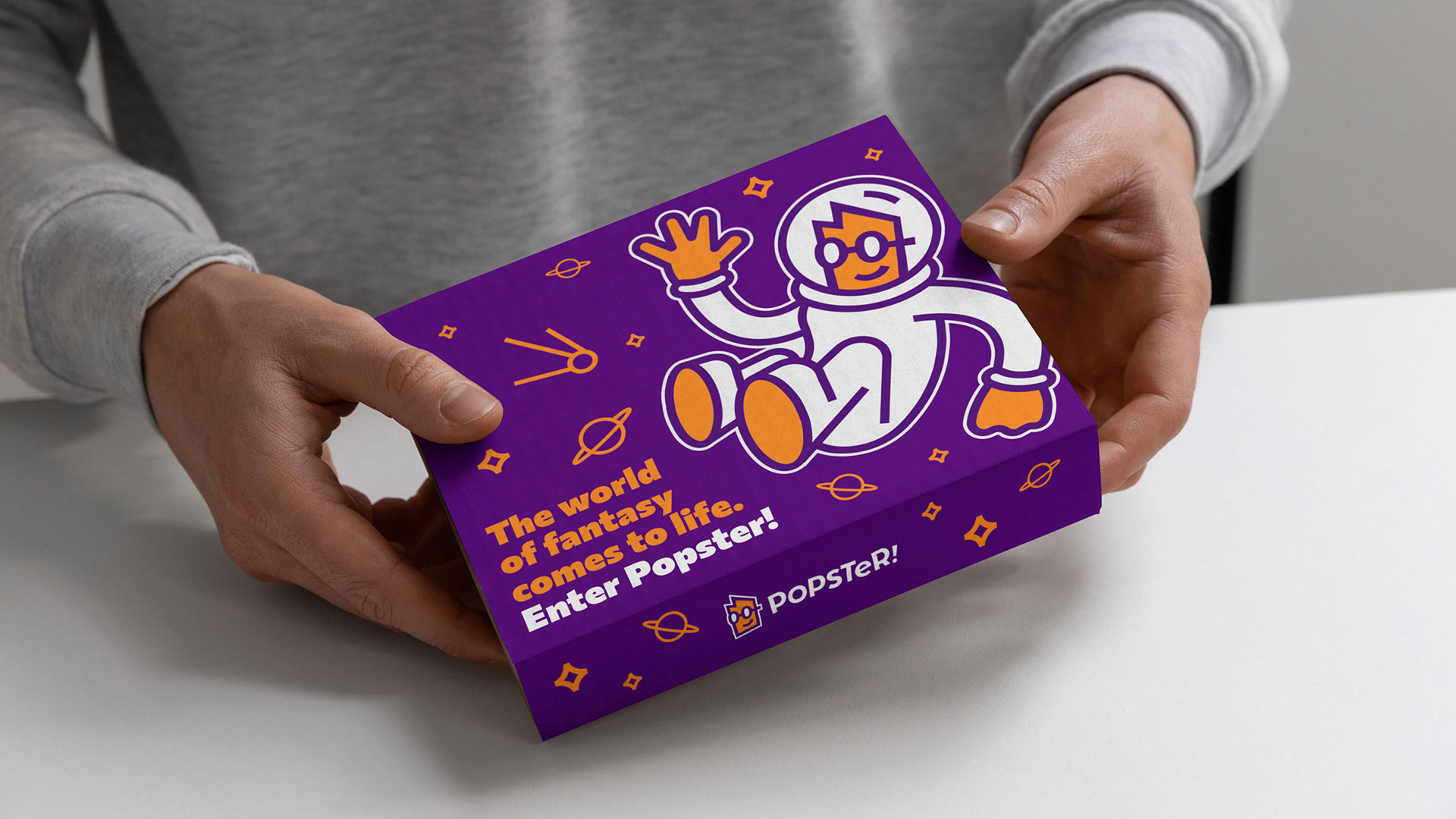
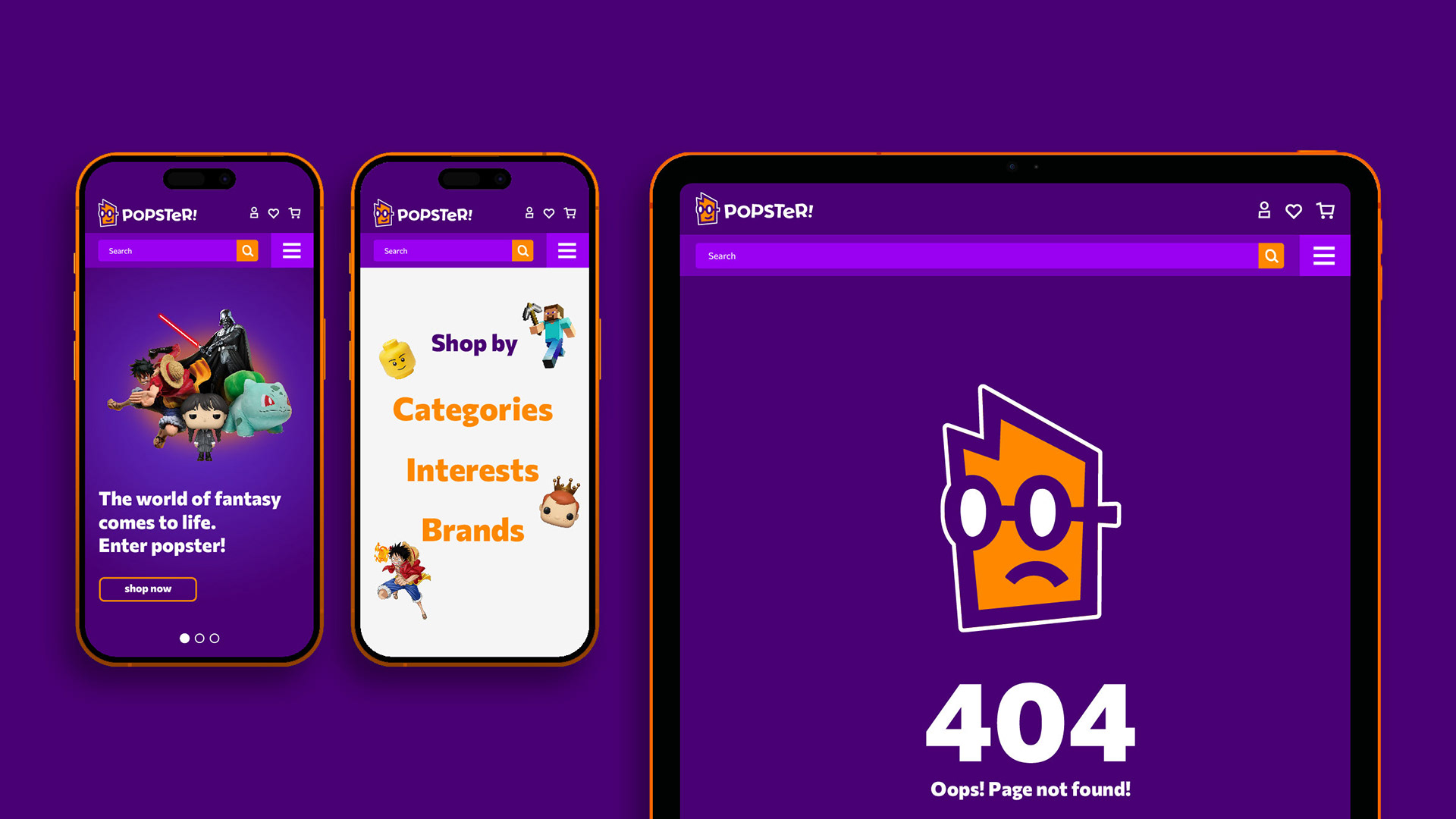
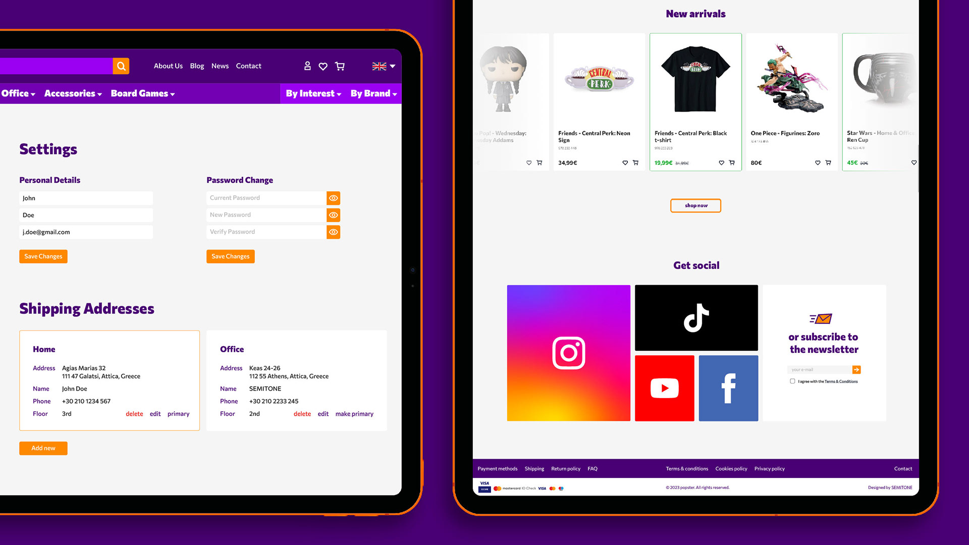
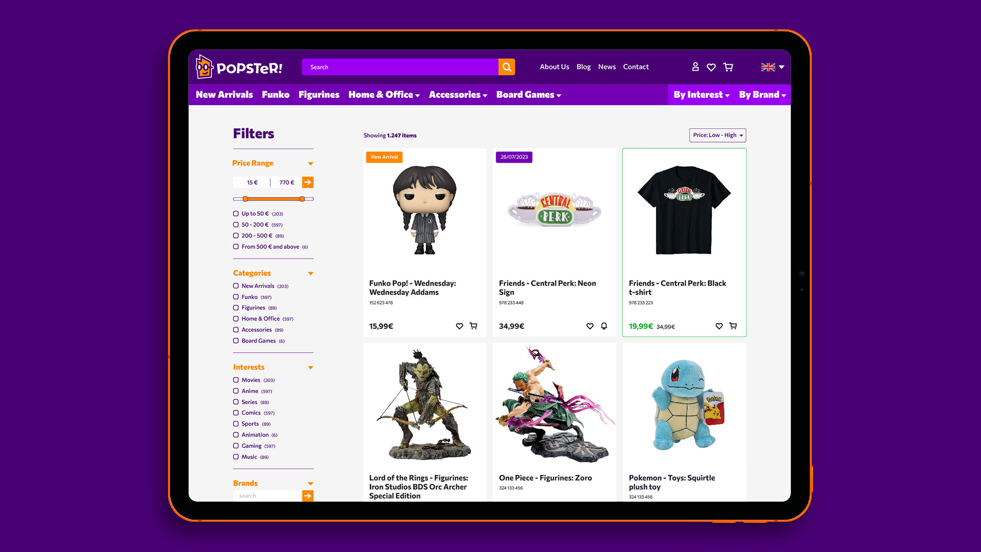
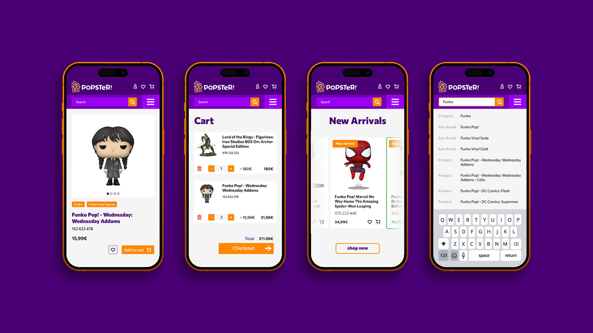
As an e-commerce website, we needed a product designed in a way to communicate popster’s character and simultaneously a professional image. This is where we utilized layering the most, in order to achieve a highly recognizable, yet clean, design.
In the entirety of the website, typography utilized bold and playful titles, along with regular, clean looking body text. Brand colors were applied throughout the website in varying hierarchy, depending on each page’s needs. The homepage and about us section had purple as a dominant color to reinforce brand recognition. Functional pages like the shop or checkout, utilized white and gray to convey transparency and promote usability. Orange was utilized to signify clickable or tappable design elements, like call to actions and buttons.