nepo gram
Logotype Design, Brand Identity, Video Animation, Packaging Design, Conceptual work
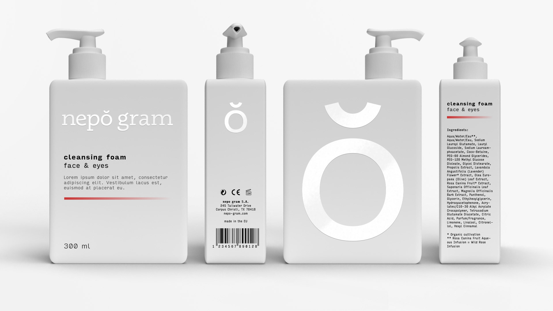
A cosmetics company with pomegranate as the key ingredient to its products. Nepo Gram is derived from the word “pomegranate”. It is both an anagram and simplification of the word.
The identity needed to communicate both the natural origin of the product as well as the science behind it.
The identity needed to communicate both the natural origin of the product as well as the science behind it.
The wordmark utilizes slab serif typography with neo-grotesque elements. The symbol depicts a pomegranate and it is directly derived from the typography. These achieve a visual character of both scientific knowledge and the simplicity of a natural key ingredient simultaneously.
The color palette of white over a light gray is a nod both at the purity of the natural ingredient and the scientist’s robes. Along with the pomegranate accent color the color palette has both an experimental character and striking visual appearance.
A monospace font was chosen as it reinforces the scientific elements of the Nepo Gram’s character.


Nepo Gram’s product series required the usage of different packages in different sizes and proportions. Pump bottles, jars, and tubes, all had to strictly comply with the visual identity.
With coherence as a key subject to the design, we placed all elements of the packaging in varying sizes, according to each pack’s size, in the same proportions. On one side of each package we placed the symbol as the only element to reinforce brand memorability.
The brand’s color palette is applied in the packaging in a manner that helps augment contrast. The entire package is light gray and features a matte texture, while the logo is white and features spot UV.