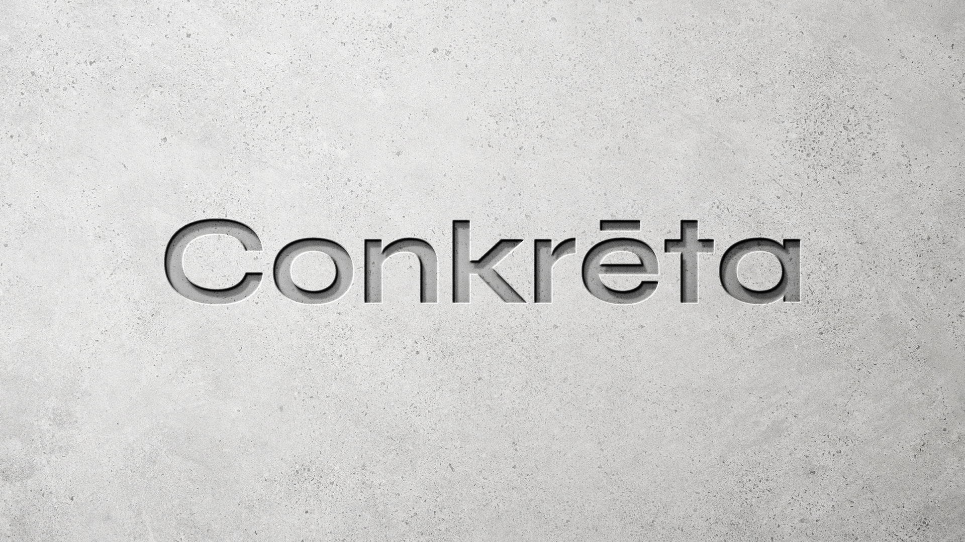
Conkreta
Logotype, Brand Identity, Packaging Design, Stationary System, Web Design, Conceptual work
A concrete manufacturer based in Crete.
The name “Conkrēta” is derived from the Esperanto word “konkreta” meaning concrete. It also serves as a descriptor of the business’ location; Crete (Creta).
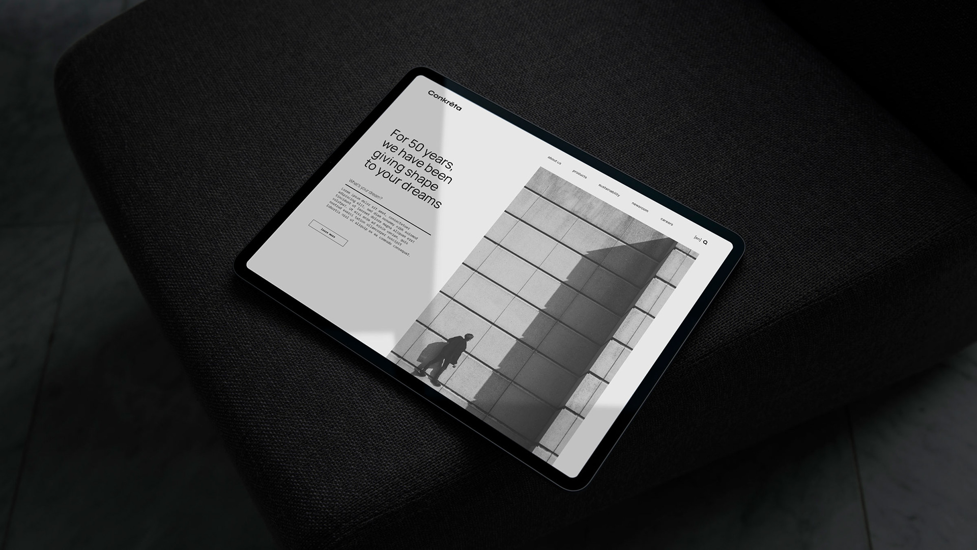
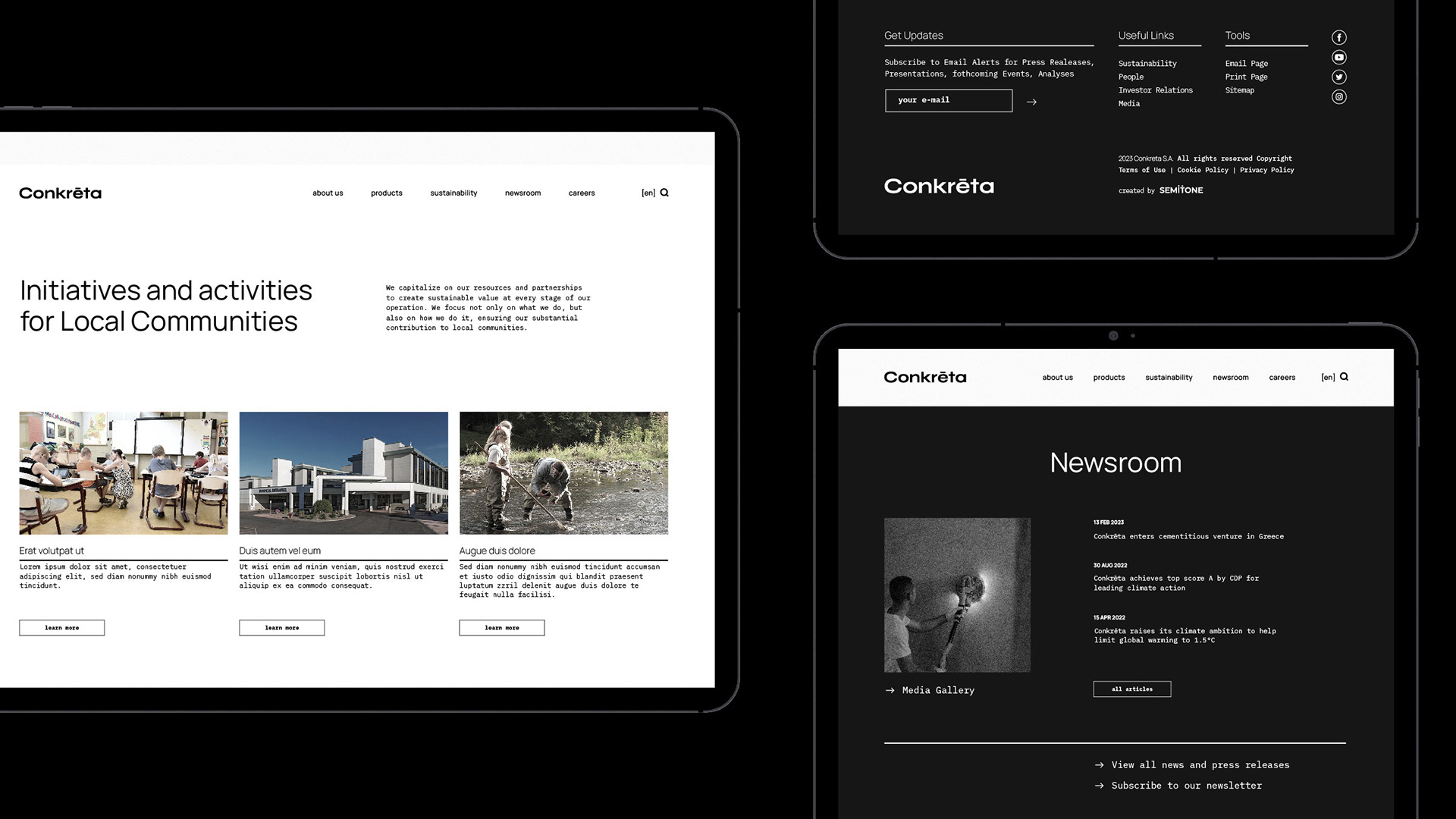
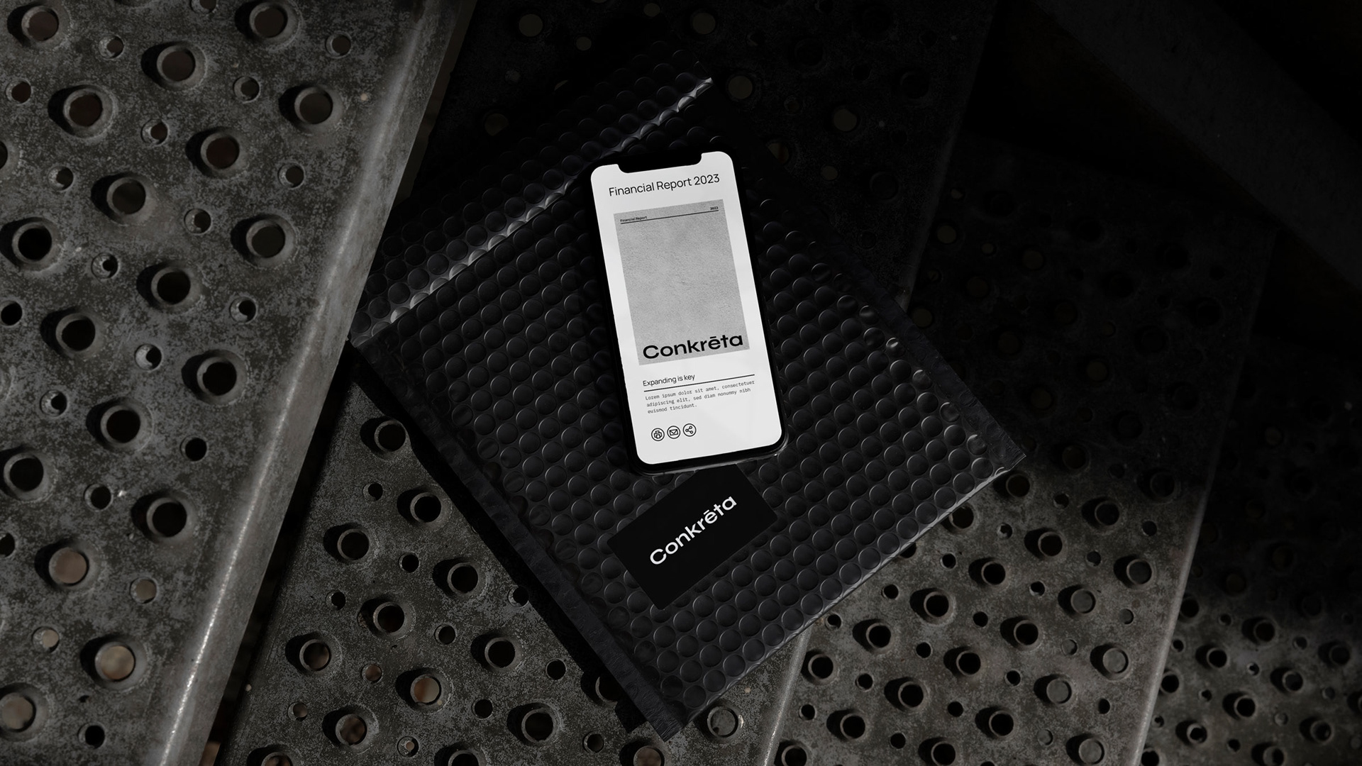
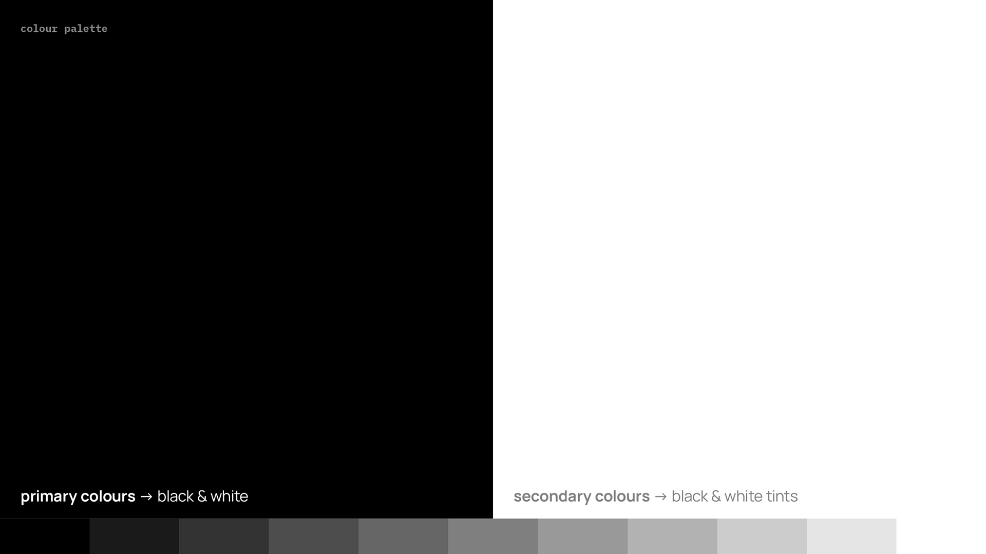
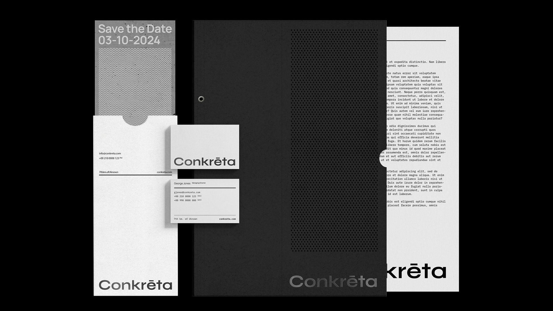
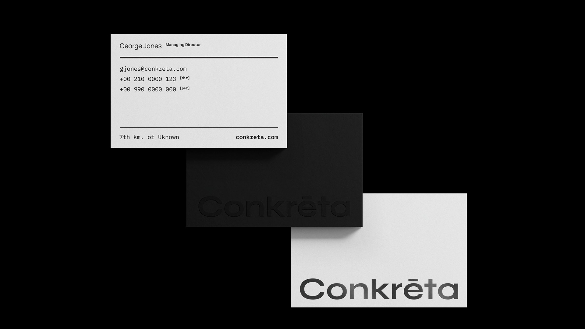
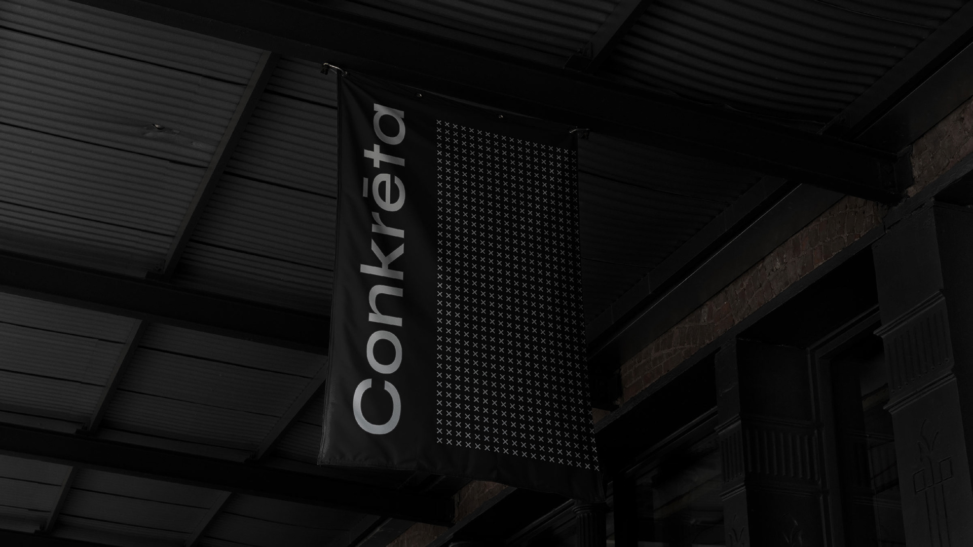
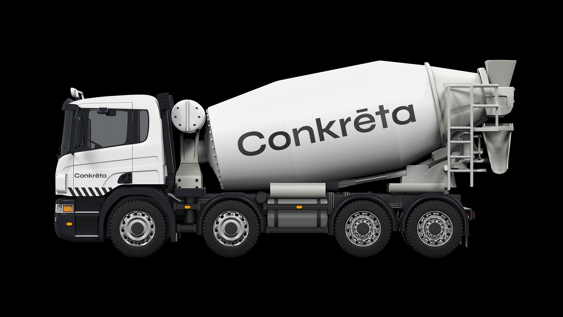
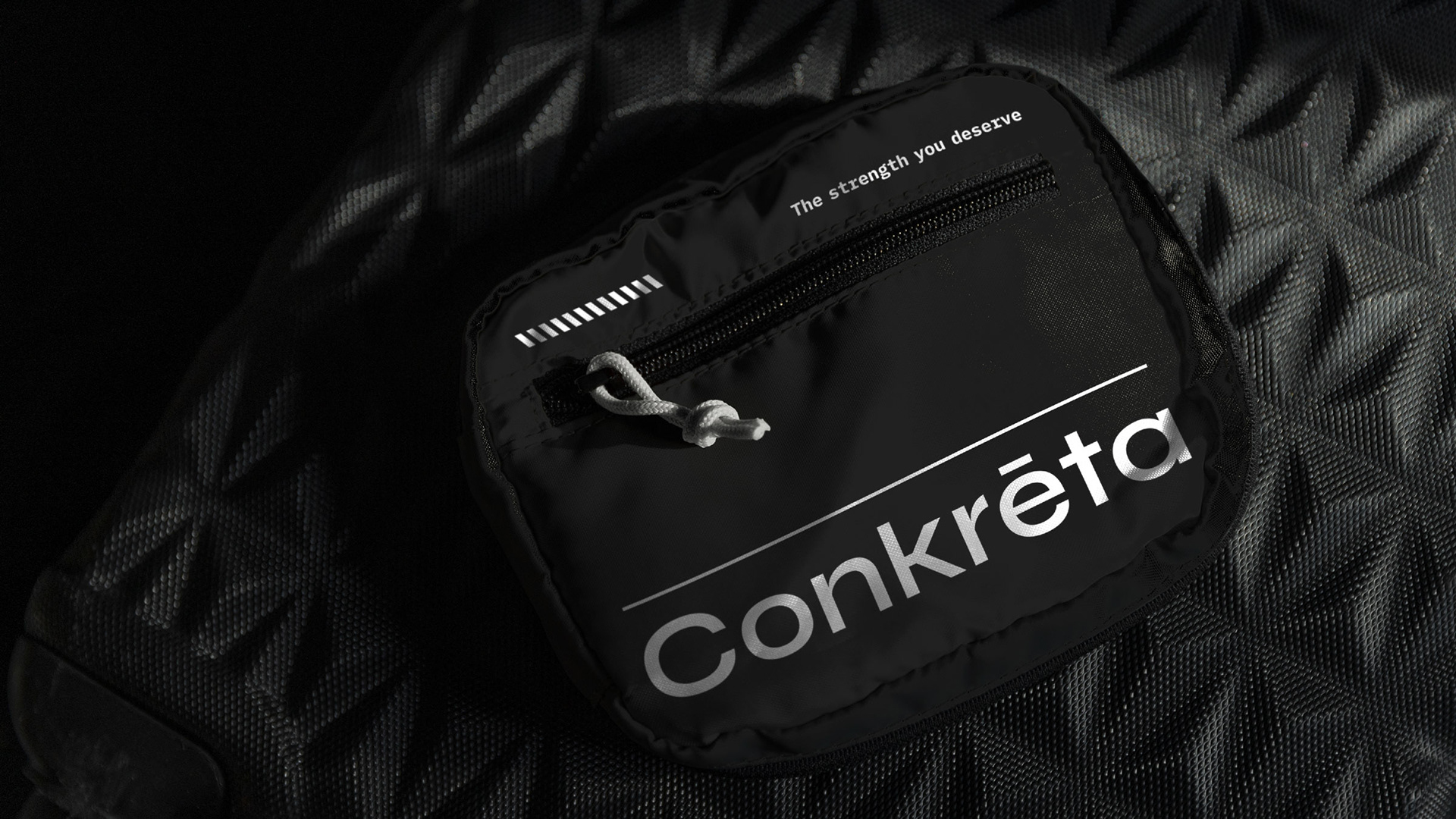
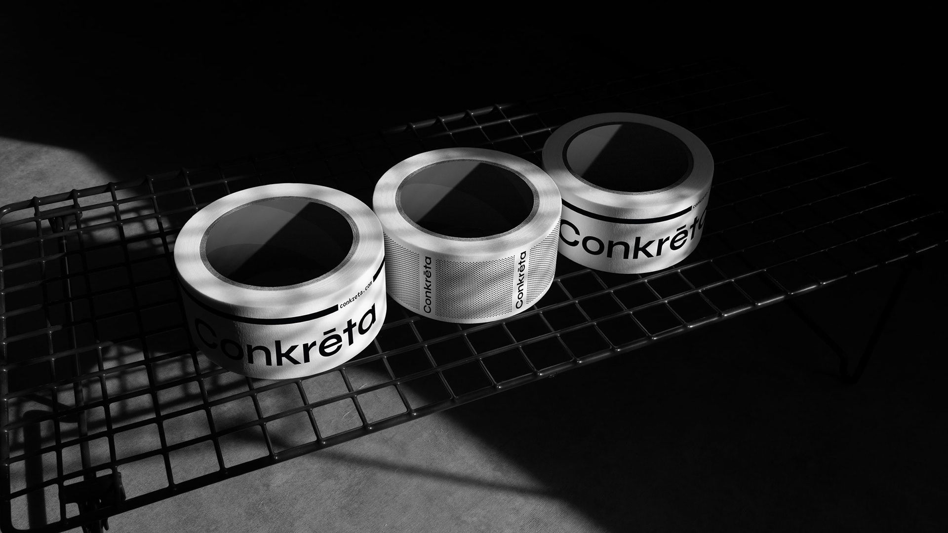
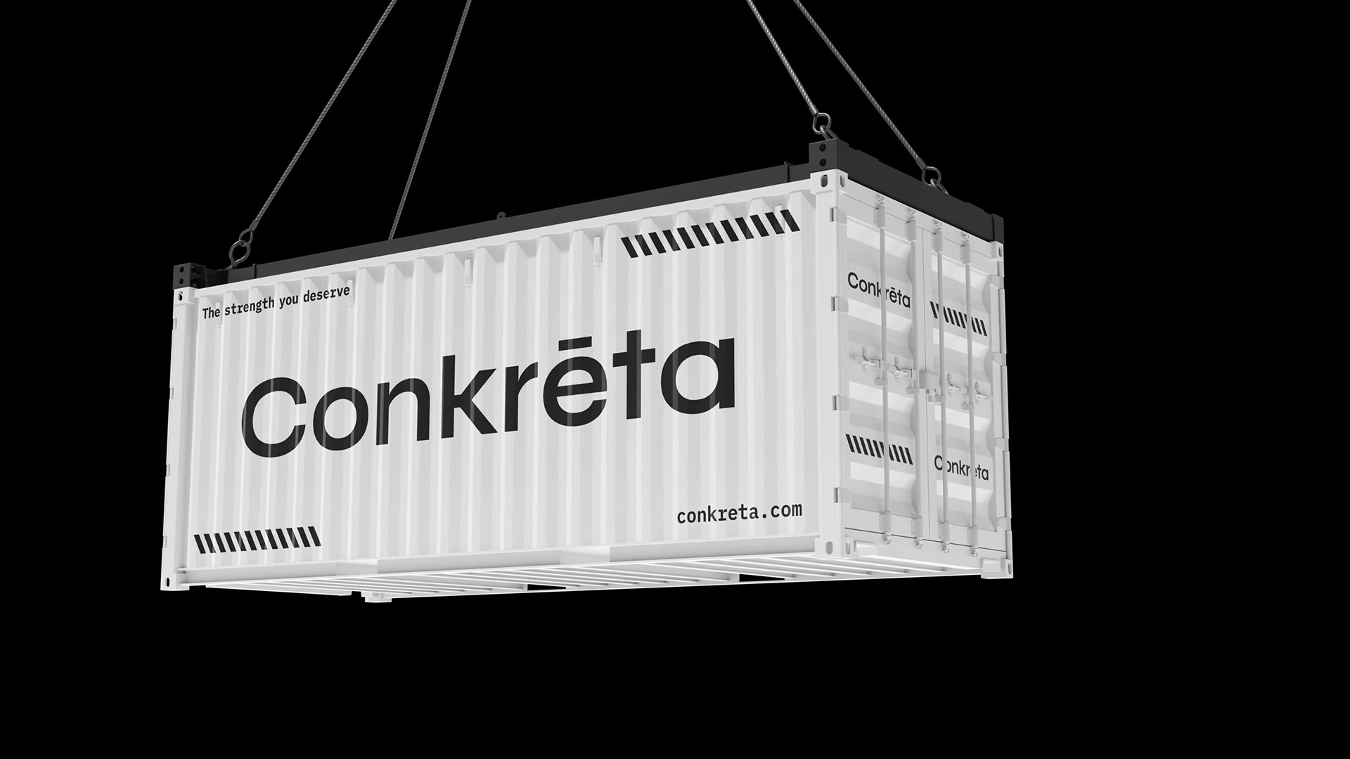
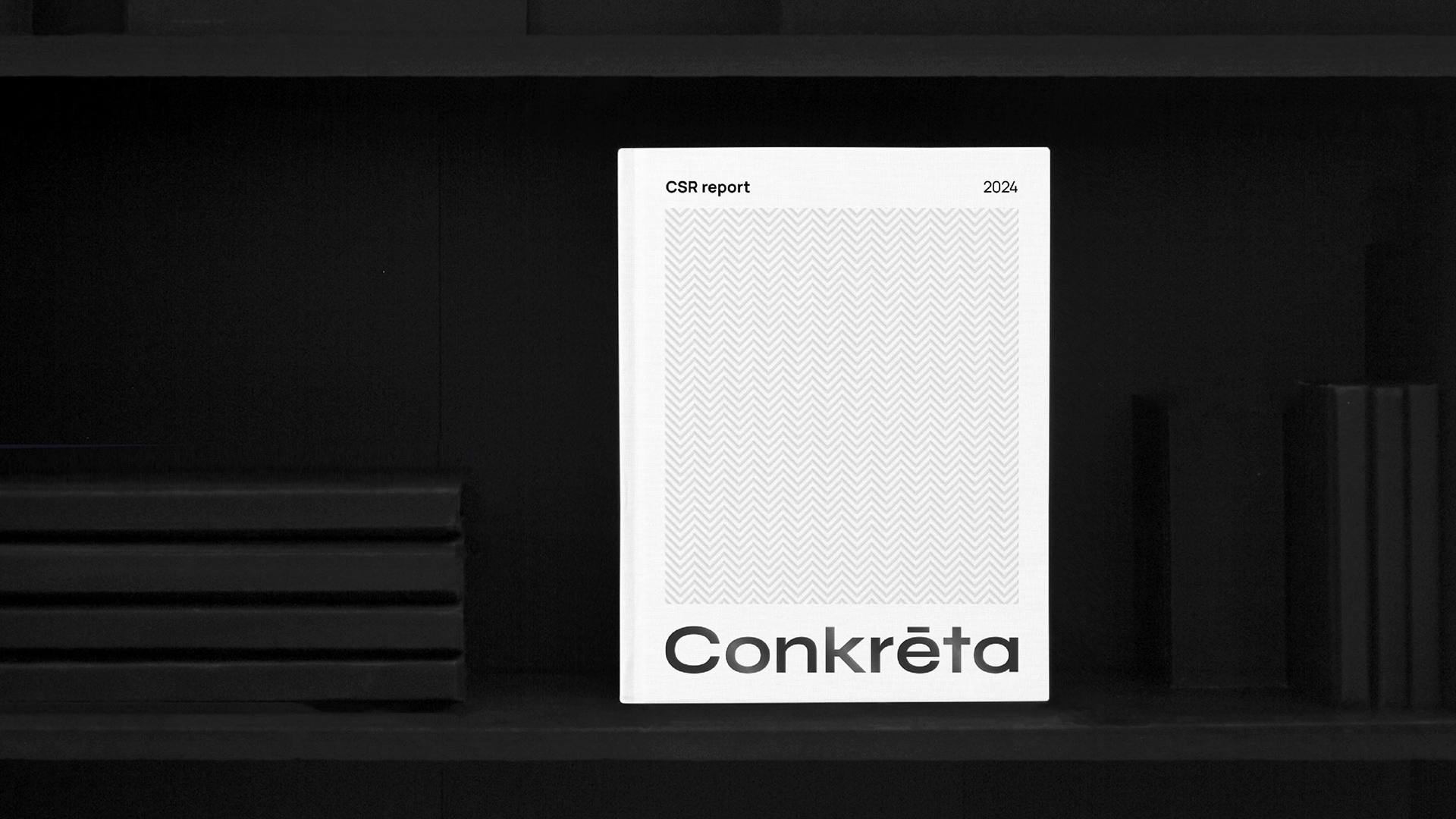
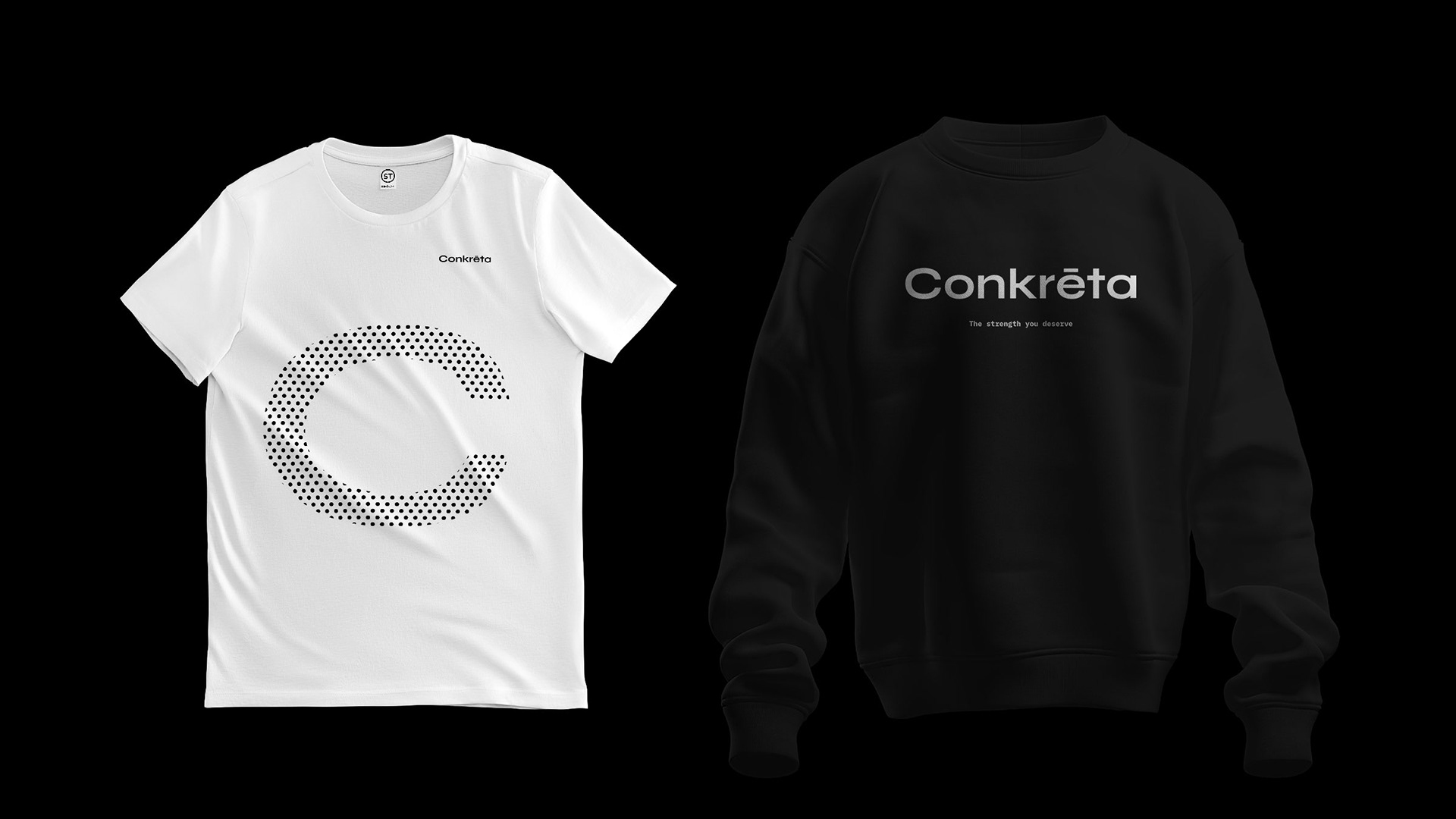
Concrete is a durable and reliable material that acts as the foundation of most modern buildings. In order to convey that, we chose black and white as the primary color palette and tones of black as secondary. This represents concrete both visually and conceptually. The color palette is dominant throughout every visual element of the identity, from flat graphics to photographs. That level of consistency describes concrete perfectly, while also reinforcing a solid visual identity.
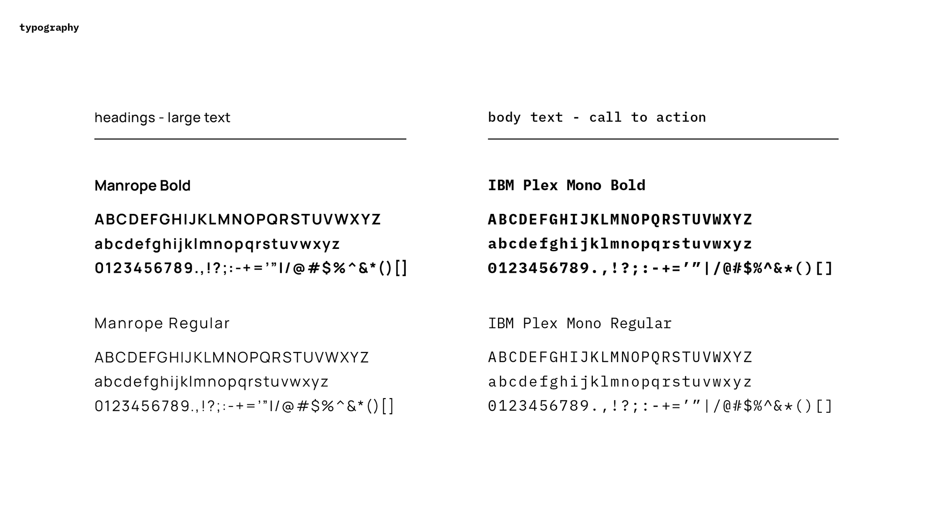
We relied on typography to convey an image of both reliability and technical expertise. Manrope for headings - big text and IBM Plex Mono for body text synergize to communicate the brand’s character.
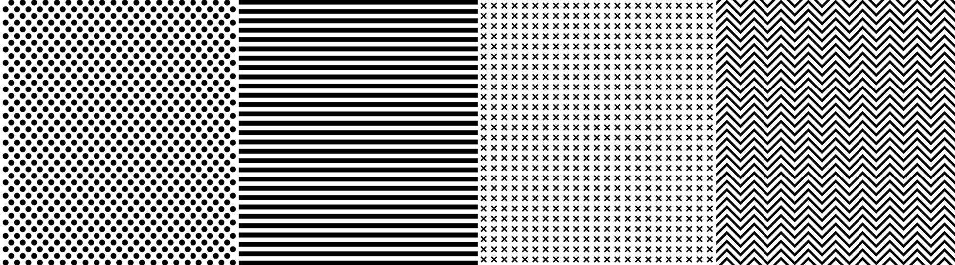
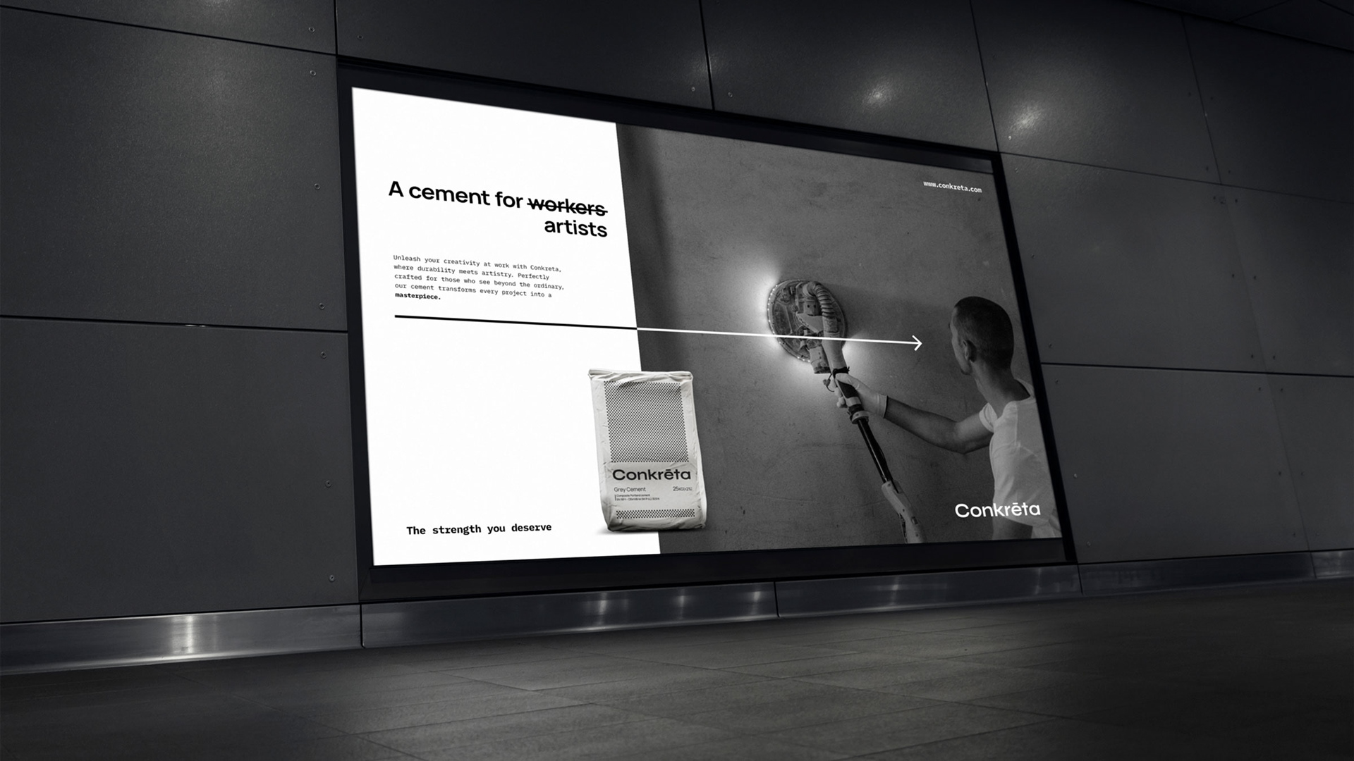
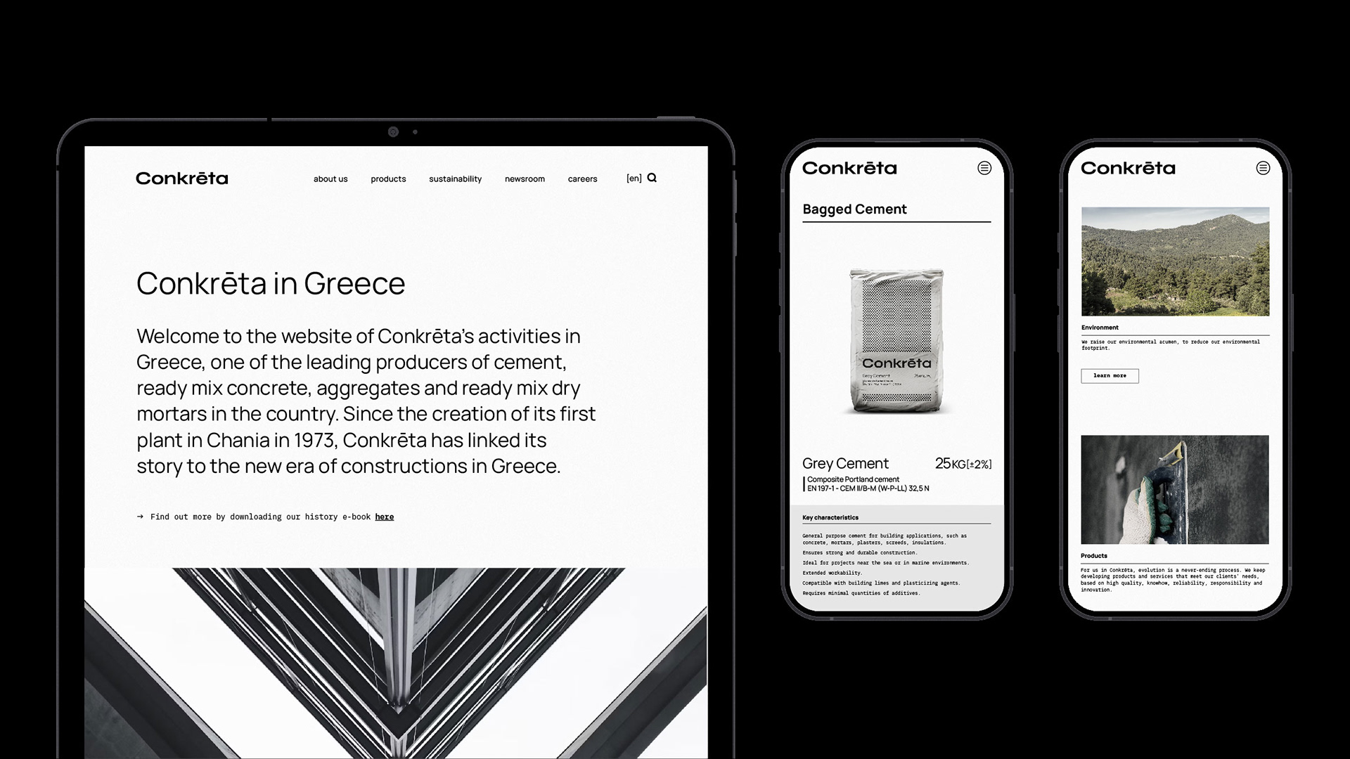
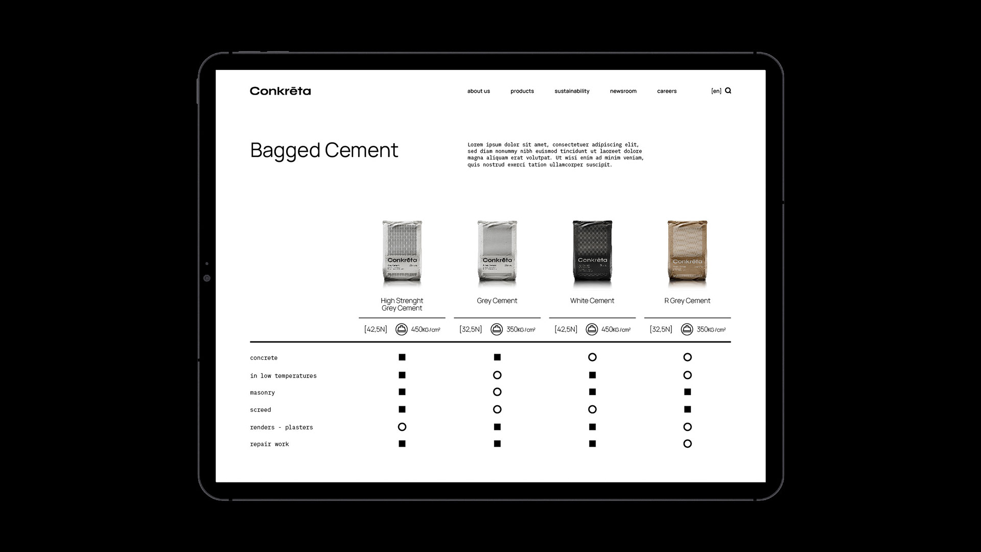
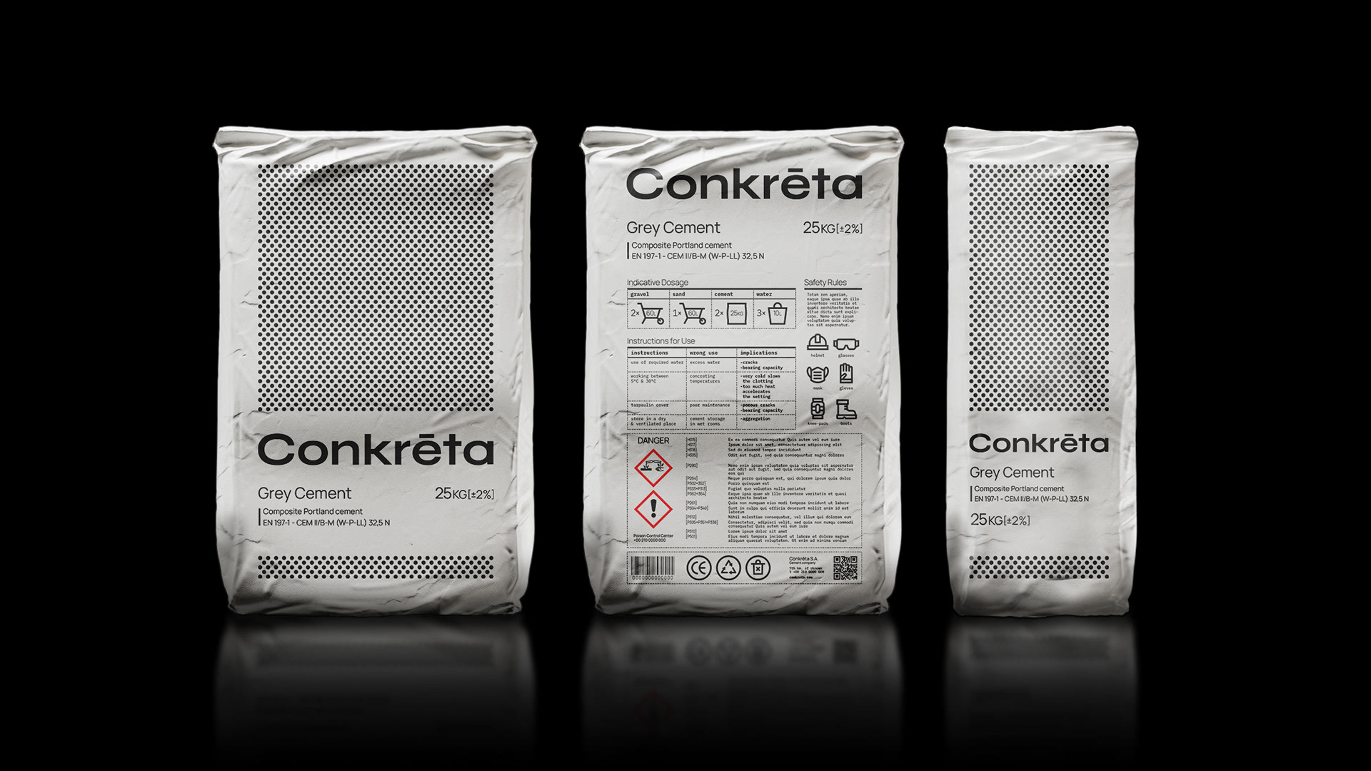
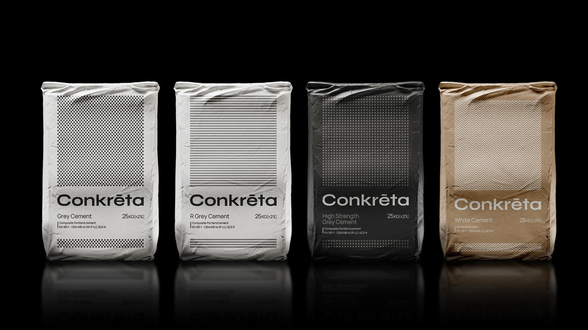
The bagged cement range includes four different products; Grey, R Grey, High Strength and White cement. Following the color palette of the brand, the entire range features black and white, reinforcing the visual identity. Illustrated patterns, as well as different backgrounds and tones were used to distinguish each product.
The back label features micro-typographic treatment in conjunction with icons and pictograms to organize and clearly convey vital information about the product.
The identity finds application to the website, in order to communicate the brand’s image as a trustworthy and reliable concrete manufacturer. In addition, the website serves as the most important tool to present information about the different types of cement. To serve both needs, a clean, minimal website was chosen as the solution.