Arpedon
Logotype, Brand identity, Web design, Communication material
Arpedon is a company offering comprehensive Industry 4.0 solutions. They help industrial plants transition into the digital world through their condition-based maintenance systems. Additionally, they undertake complete engineering projects where contemporary industrial practices are central.
When they entrusted us with developing their corporate image, we had a clear project scope. The identity needed to convey both cutting-edge technology and a strong presence in the manufacturing and infrastructure industries.
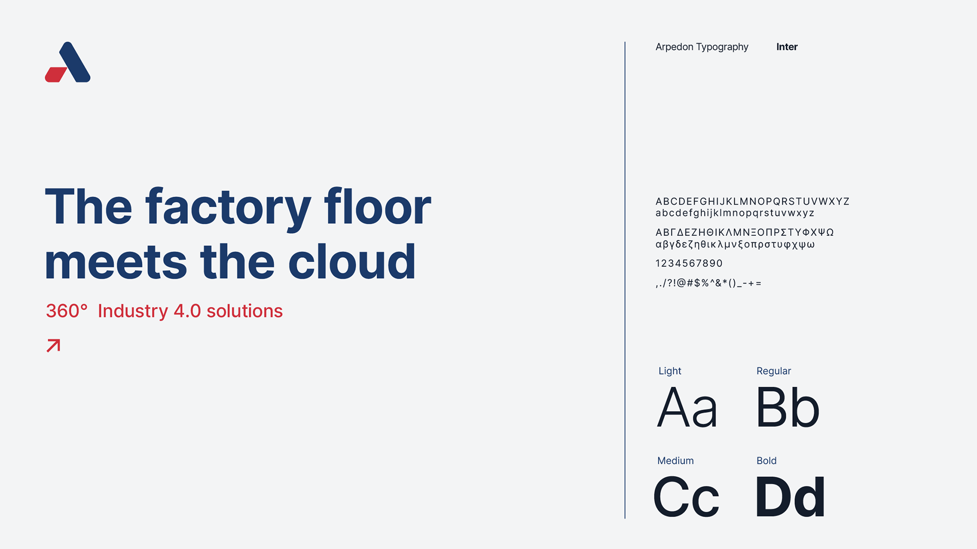
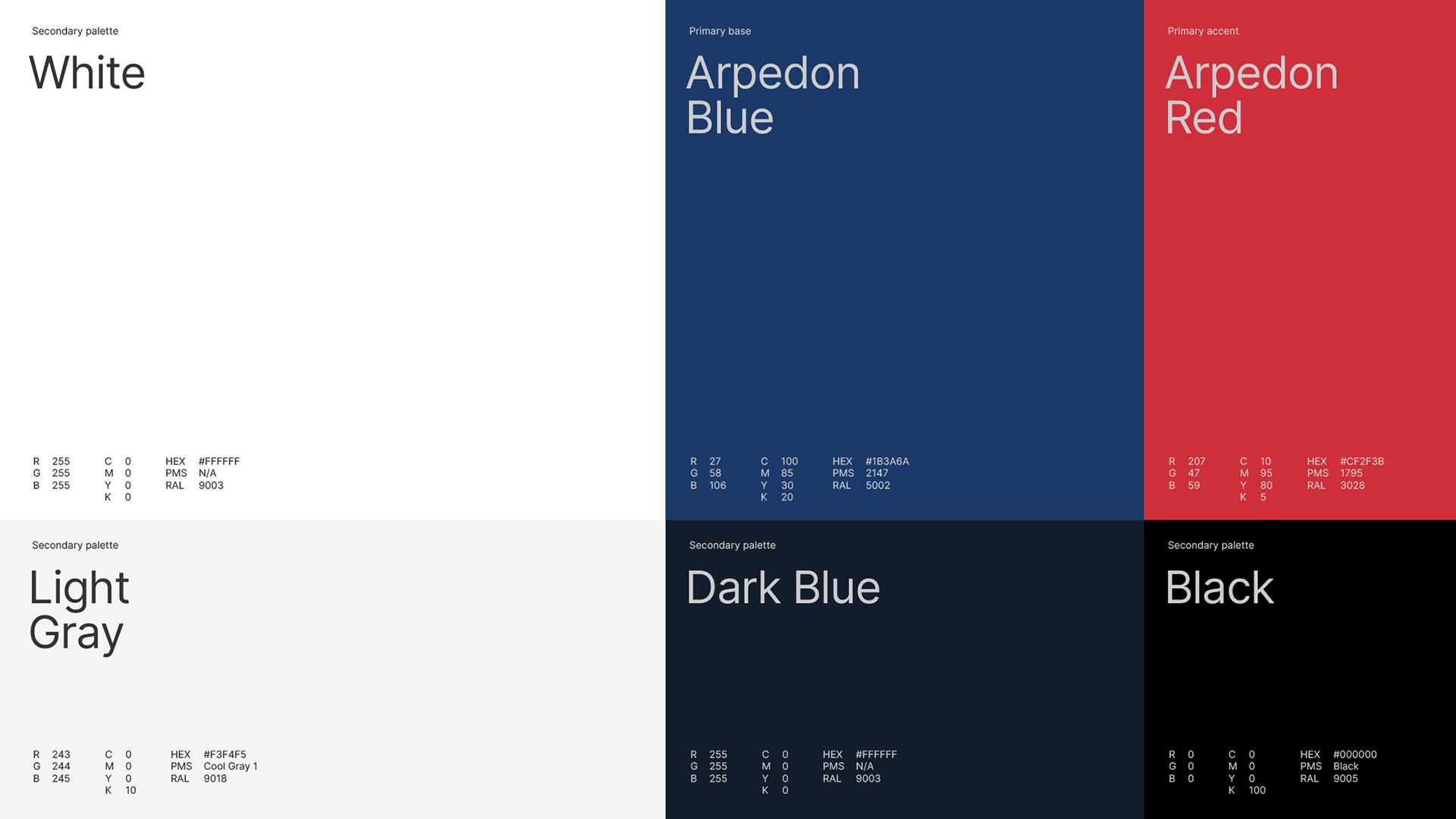
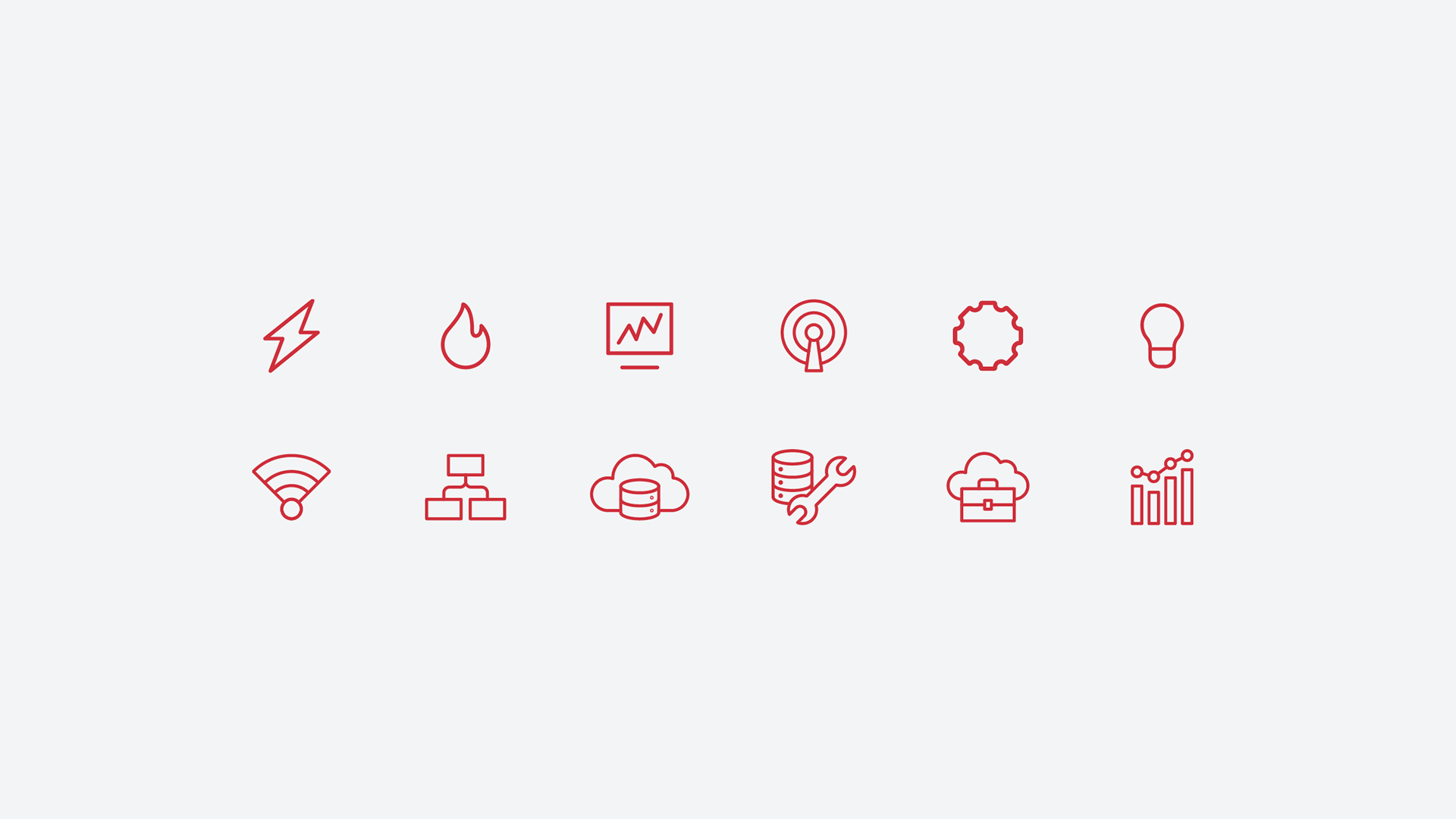
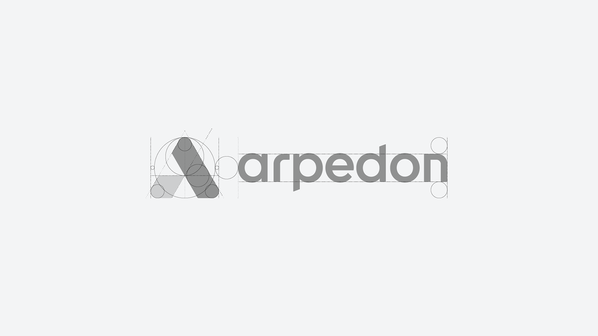
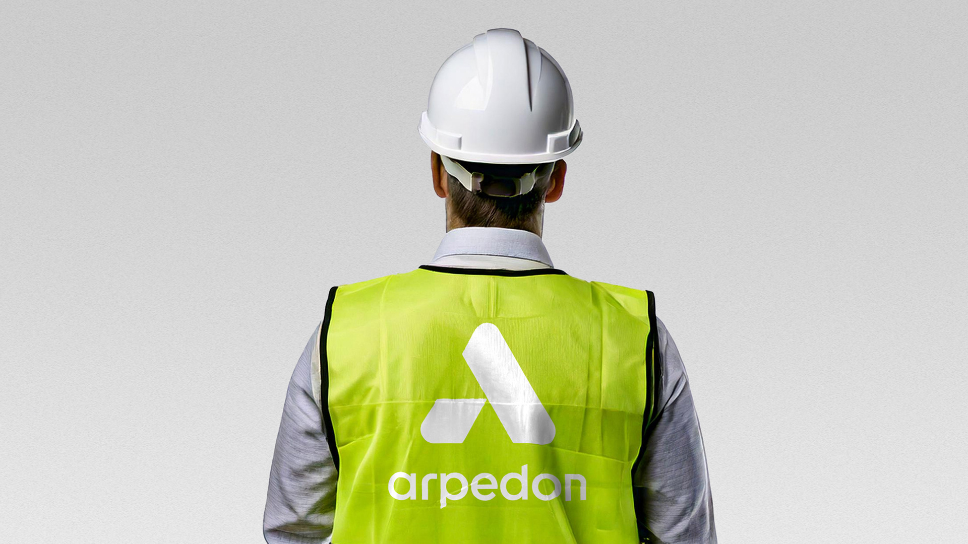
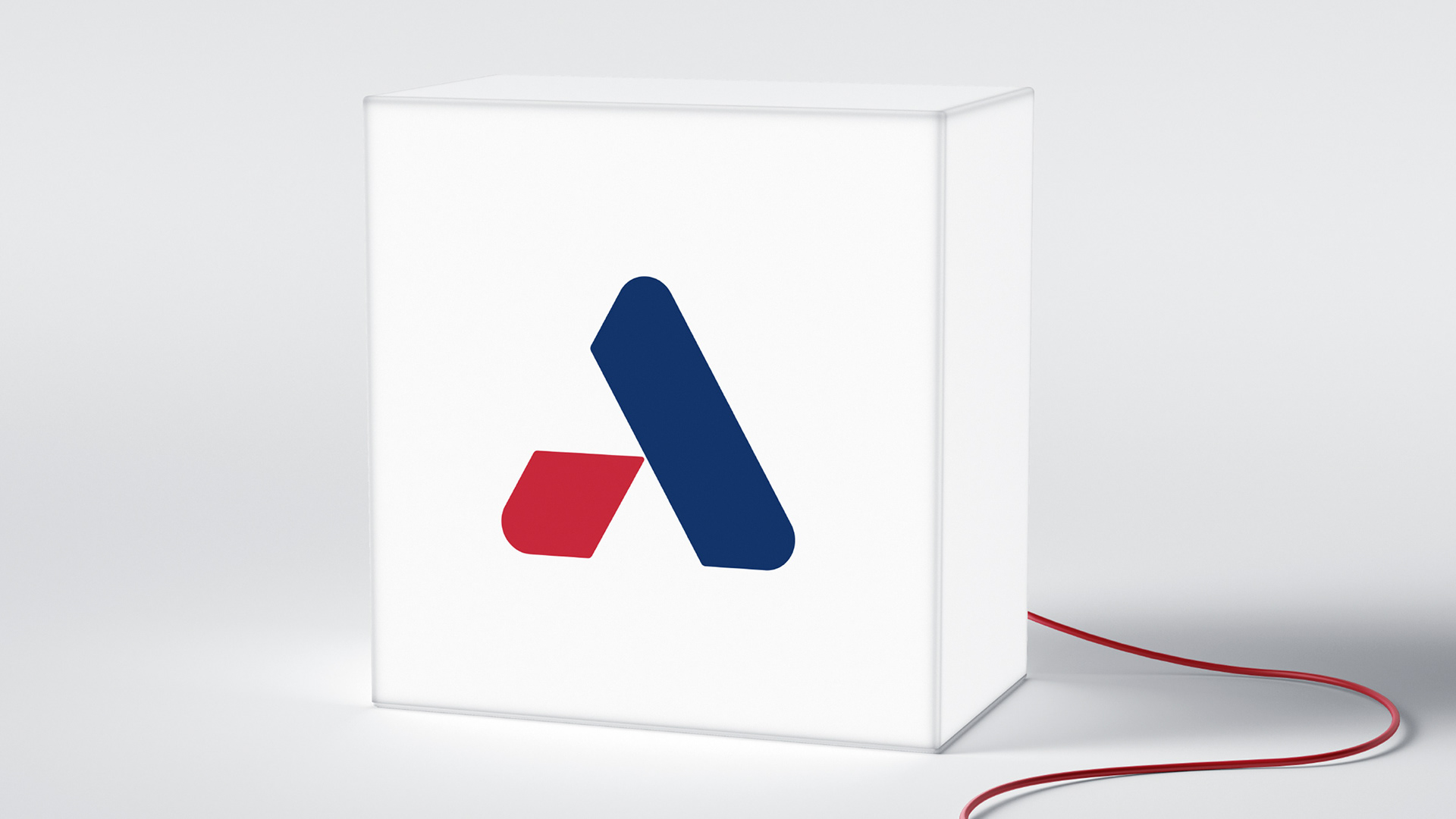
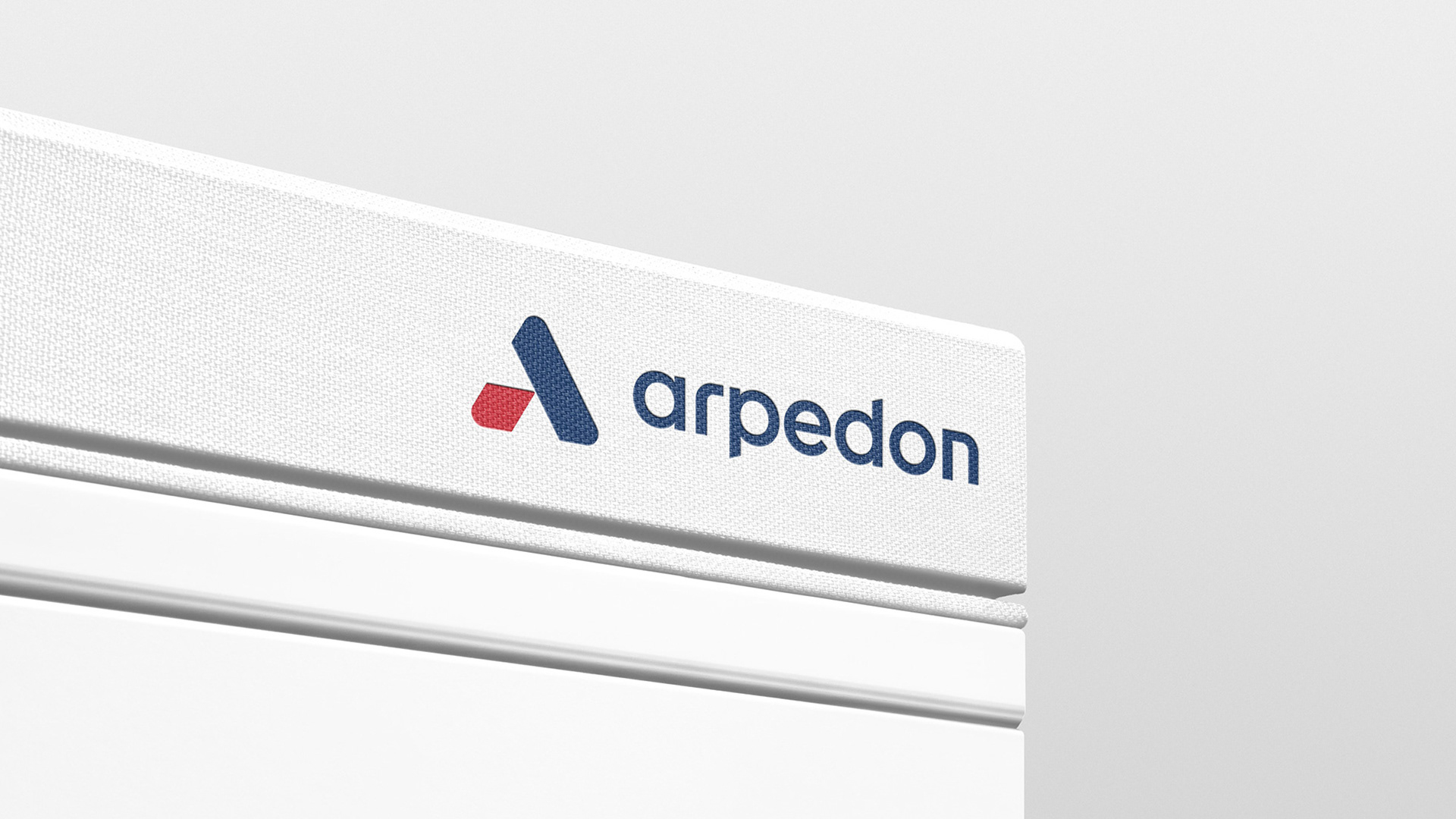
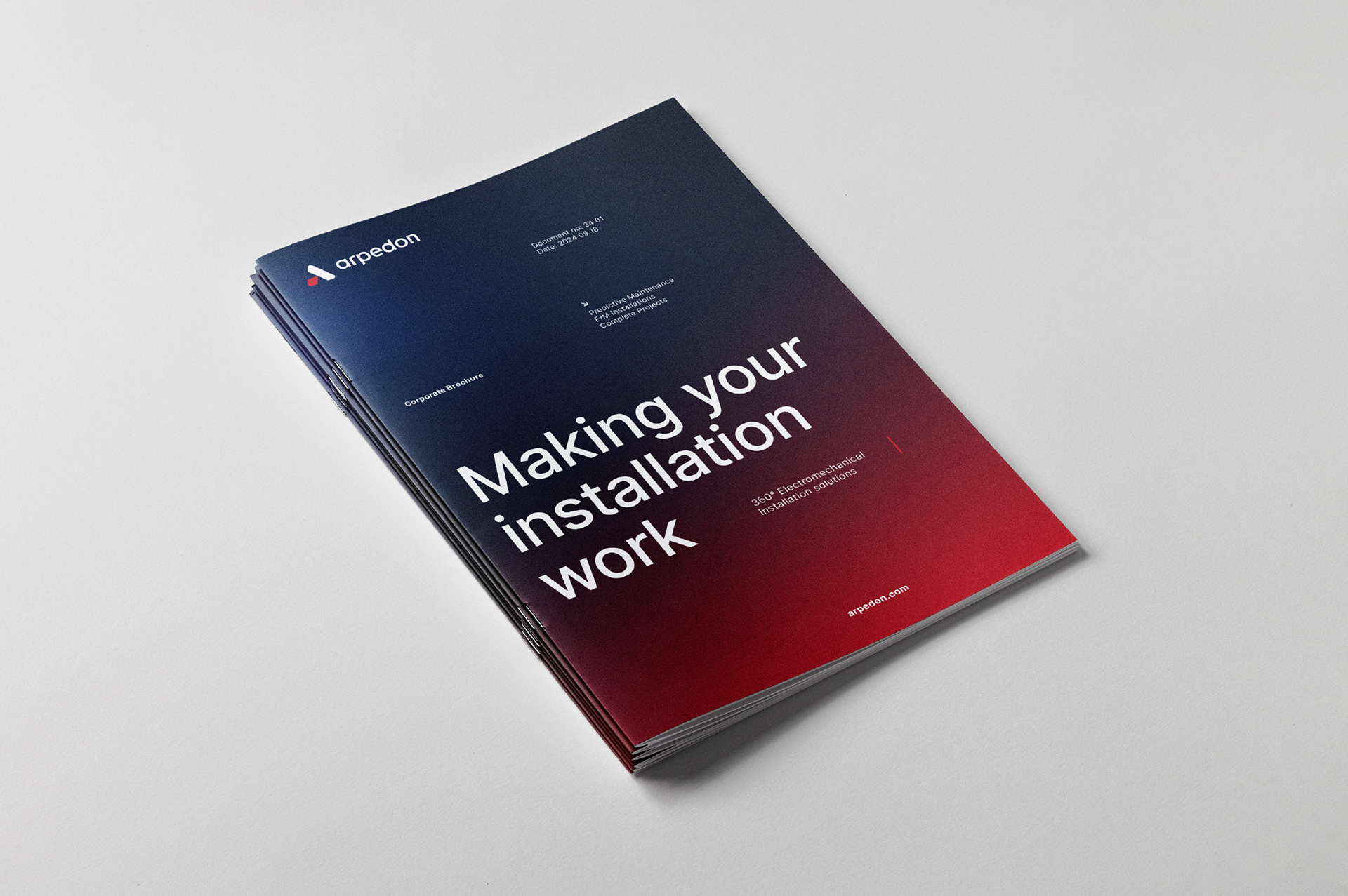
The logotype was redesigned, maintaining the "A" monogram to represent both establishment and technological innovation. The brand's blue and red colors were refined, with additional supportive colors introduced. Across all applications, we used Rasmus Andersson’s Inter font in varying weights and sizes, accompanied by lines to compartmentalize information. This system was translated into the website, serving as our primary mechanism to structure and highlight Arpedon’s products and services.
